
So you’re a scientist or data analyst, and you have a little experience interpreting p-values from statistical tests. But then you come across a case where you have hundreds, thousands, or even millions of p-values. Perhaps you ran a statistical test on each gene in an organism, or on demographics within each of hundreds of counties. You might have heard about the dangers of multiple hypothesis testing before. What’s the first thing you do?
Make a histogram of your p-values. Do this before you perform multiple hypothesis test correction, false discovery rate control, or any other means of interpreting your many p-values. Unfortunately, for some reason this basic and simple task rarely gets recommended (for instance, the Wikipedia page on the multiple comparisons problem never once mentions this approach). This graph lets you get an immediate sense of how your test behaved across all your hypotheses, and immediately diagnose some potential problems. Here I’ll walk you through a basic example of interpreting a p-value histogram.
Here are six approximate versions of what your histogram might look like. We’ll explore what each one means in turn.
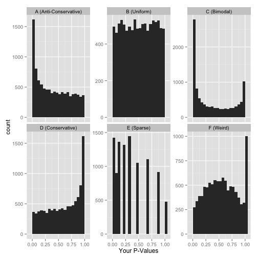
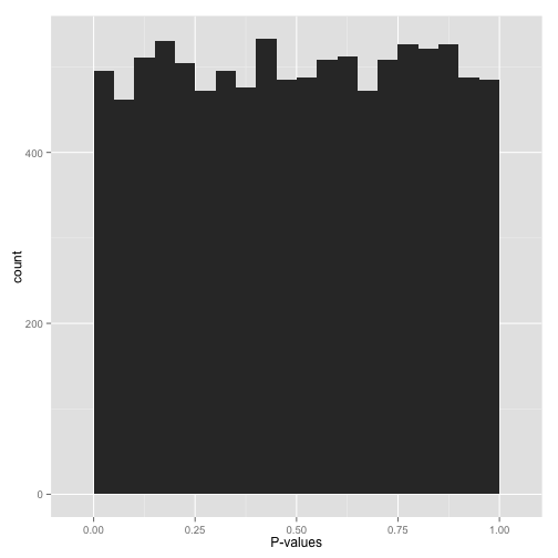
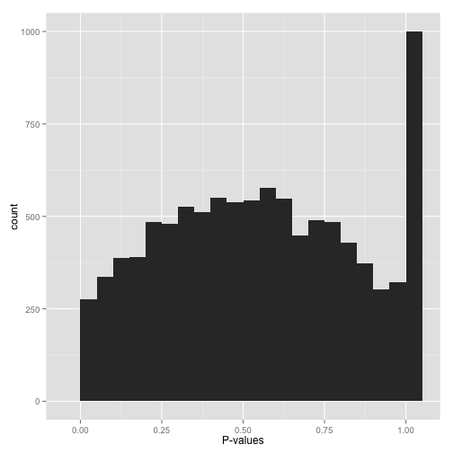
Scenario A: Anti-conservative p-values (“Hooray!”)
If your p-values look something like this:
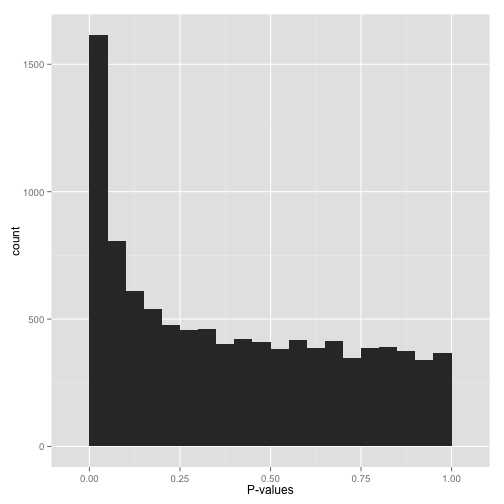
then it’s your lucky day! You have (on the surface) a set of well-behaved p-values.
That flat distribution along the bottom is all your null p-values, which are uniformly distributed between 0 and 1. Why are null p-values uniformly distributed? Because that’s part of a definition of a p-value: under the null, it has a 5% chance of being less than .05, a 10% chance of being less than .1, etc. This describes a uniform distribution.
That peak close to 0 is where your alternative hypotheses live- along with some potential false positives. If we split this up into nulls and alternatives, it might look like this:
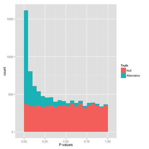
Notice that there are plenty of null hypotheses that appear at low p-values, so you can’t just say “call all p-values less than .05 significant” without thinking, or you’ll get lots of false discoveries. Notice also that some alternative hypotheses end up with high p-values: those are the hypotheses you won’t be able to detect with your test (false negatives). The job of any multiple hypothesis test correction is to figure out where best to place the cutoff for significance.
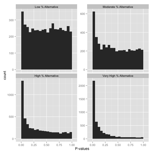
Now, just how many of your hypotheses are alternative rather than null? You can get a sense of this from a histogram by looking at how tall the peak on the left is: the taller the peak, the more p-values are close to 0 and therefore significant. Similarly, the “depth” of the histogram on the right side shows how many of your p-values are null.
Note that if you want a more quantitative estimate of what fraction of your hypotheses are null (sometimes called \(\pi_0\)), you can use the method of Storey & Tibshirani 2003. In R, you can use the qvalue package to do this.
Scenario B: Uniform p-values (“Awww…”)
Alternatively, you might see a flat distribution (what statisticians call a “uniform” distribution):
This is what your p-values would look like if all your hypotheses were null. Now, seeing this does not mean they actually are all null! It does mean that
- At most a small percentage of hypotheses are non-null. An FDR correction method such as Benjamini-Hochberg will let you identify those.
- Applying an uncorrected rule like “Accept everything with p-value less than .05” is certain to give you many false discoveries. Don’t do it!
Scenario C: Bimodal p-values (“Hmmm…”)
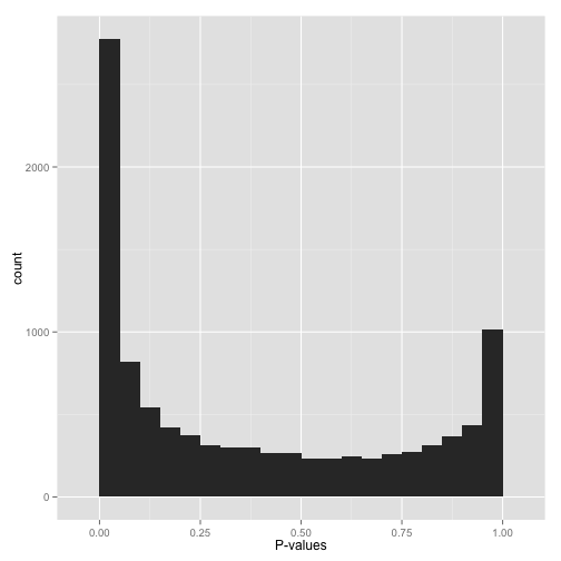
So you have a peak at 0, just like you saw in (A)… but you also have a peak close to 1. What do you do?
Don’t apply false discovery rate control to these p-values yet. (Why not? Because some kinds of FDR control are based on the assumption that your p-values near 1 are uniform. If you break this assumption, you’ll get way fewer significant hypotheses. Everyone loses).
Instead, figure out why your p-values show this behavior, and solve it appropriately:
- Are you applying a one-tailed test (for example, testing whether each gene increased its expression in response to a drug)? If so, those p-values close to 1 are cases that are significant in the opposite direction (cases where genes decreased their expression). If you want your test to find these cases, switch to a two-sided test. If you don’t want to include them at all, you can try filtering out all cases where your estimate is in that direction.
- Do all the p-values close to 1 belong to some pathological case? An example from my own field: RNA-Seq data, which consists of read counts per gene in each a variety of conditions, will sometimes include genes for which there are no reads in any condition. Some differential expression software will report a p-value of 1 for these genes. If you can find problematic cases like these, just filter them out beforehand (it’s not like you’re losing any information!)
Scenario D: Conservative p-values (“Whoops…”)
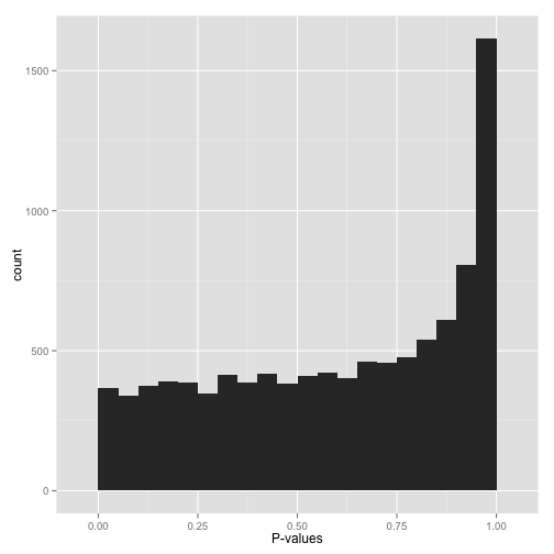
Do not look at this distribution and say, “Oh, I guess I don’t have any significant hypotheses.” If you had no significant hypotheses, your p-values would look something like (B) above. P-values are specifically designed so that they are uniform under the null hypothesis.
A graph like this indicates something is wrong with your test. Perhaps your test assumes that the data fits some distribution that it doesn’t fit. Perhaps it’s designed for continuous data while your data is discrete, or perhaps it is designed for normally-distributed data and your data is severely non-normal. In any case, this is a great time to find a friendly statistician to help you.
(Update 12/17/14: Rogier in the comments helpfully notes another possible explanation: your p-values may have already been corrected for multiple testing, for example using the Bonferroni correction. If so, you might want to get your hands on the original, uncorrected p-values so you can view the histogram yourself and confirm it’s well behaved!)
Scenario E: Sparse p-values (“Hold on…”)
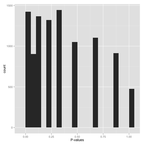
Sparse p-values are easy to recognize by those big gaps in the histogram. What this means is that while you may have (say) 10,000 hypotheses, they generated only a small number of distinct p-values. You can find out just how many distinct p-values your test generated with this line of R code:
length(unique(mypvalues))
Why did you get p-values like this? Did you:
- Run a bootstrap or permutation test with too few iterations? Try increasing the number of iterations.
- Run a nonparametric test (e.g. the Wilcoxon rank-sum test or Spearman correlation) on data with a small sample size? If you can, either get more data or switch to a parametric test.
Don’t run false discovery rate control, which typically makes the assumption that the p-value distribution is (roughly) continuous. If you absolutely need to use these p-values (and can’t switch to a test that doesn’t give you such sparse p-values), find a statistician!
Scenario F: Something even weirder (“What the…?!?”)
Big bump in the middle? Bunch of random peaks? Something that looks like nothing from this post?
Stop whatever you’re doing, and find a statistician. There may be a simple explanation and/or fix, but you want to make sure you’ve found it before you work with these p-values any more.
In closing: this post isn’t a replacement for having a qualified statistician look over your data. But just by glancing at this simple visualization, you can tell a lot about how your test performed across your hypotheses- and you’ll be a lot closer to knowing what to do with them.