Lesson 3: Statistical Testing and Prediction
Segment 1: Comparing Two Samples
The phrase "lying with statistics" is a popular term for the manipulation and misrepresentation of data. But this association of the term statistics with dishonesty is unfortunate, because the science of statistics is in fact designed precisely to keep you from lying. More specifically, the framework of statistical hypothesis testing is designed to prevent you from making erroneous conclusions based on random chance, or noise. I'm David Robinson, and today we're going to be introducing statistical testing and prediction in R.
We'll assume that you are familiar with some of the basics of R, including variables, matrices, data frames, and functions, and we'll be using the ggplot2 package, which was discussed in a previous lesson, to make visualizations of our data. Finally, some very basic familiarity with statistics, including understanding the concept of a hypothesis test, a p-value, and a confidence interval, will be useful for appreciating the tests we explore. Something we won't be going over is the mathematical formulas or justifications behind any of these statistical tests. These can easily be found in a statistics class or textbook if you're interested in learning more about them, or even doing them by hand. Instead, we'll focus on how these tests can be implemented in R. These are far from the only methods R offers: once you understand how to apply these basic methods, it's easy to explore others.
One essential statistical method is to test for a difference between two samples, or groups. For example, one might see whether a group of patients who were given a medical treatment had better outcomes than a control group. In our examples in this lesson, we're going to be analyzing a question of fuel efficiency as it relates to some aspects of automobile design and performance. We'll work with a dataset built into R, called mtcars, that comes from a 1974 issue of Motor Trends magazine. Recall that you can load a built-in dataset into R with the line
data("mtcars")This loads the data into your environment. You can visualize it with the View function:
View(mtcars)head(mtcars)## mpg cyl disp hp drat wt qsec vs am gear carb
## Mazda RX4 21.0 6 160 110 3.90 2.620 16.46 0 1 4 4
## Mazda RX4 Wag 21.0 6 160 110 3.90 2.875 17.02 0 1 4 4
## Datsun 710 22.8 4 108 93 3.85 2.320 18.61 1 1 4 1
## Hornet 4 Drive 21.4 6 258 110 3.08 3.215 19.44 1 0 3 1
## Hornet Sportabout 18.7 8 360 175 3.15 3.440 17.02 0 0 3 2
## Valiant 18.1 6 225 105 2.76 3.460 20.22 1 0 3 1You can find out more about this variable with the help function:
help(mtcars)Notice that each line of mtcars represents one model of car, which we can see in the rownames. Each column is then one attribute of that car, such as the miles per gallon (or fuel efficiency), the number of cylinders, the displacement (or volume) of the car's engine in cubic inches, whether the car has an automatic or manual transmission, and so on. Recall that we can access one of these columns using the dollar sign: for example:
mtcars$mpg## [1] 21.0 21.0 22.8 21.4 18.7 18.1 14.3 24.4 22.8 19.2 17.8 16.4 17.3 15.2
## [15] 10.4 10.4 14.7 32.4 30.4 33.9 21.5 15.5 15.2 13.3 19.2 27.3 26.0 30.4
## [29] 15.8 19.7 15.0 21.4extracts the vector of miles per gallon. Let's say we're interested in testing the hypothesis that cars with an automatic transmission use more fuel than cars with a manual transmission. Whether cars have an automatic or manual transmission is found in the am column:
mtcars$am## [1] 1 1 1 0 0 0 0 0 0 0 0 0 0 0 0 0 0 1 1 1 0 0 0 0 0 1 1 1 1 1 1 1We can see from the help page that 0 represents an automatic transmission and 1 means a manual transmission.
Before we perform a statistical test, it's always a good idea to create a graphical visualization. Recall that a boxplot compares the distributions of multiple groups, and so is well suited for this task. To do this, first we load the ggplot2 package:
library(ggplot2)Then we can create a boxplot with the following line.
ggplot(mtcars, aes(x=factor(am), y=mpg)) + geom_boxplot()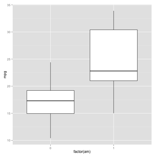
As with any ggplot2 call, we start with ggplot(), then the data we'll be plotting (mtcars). Then a mapping of the aesthetics (in this case, transmission on the x-axis and miles per gallon on the y-axis. Why do we need to turn am into a factor: because ggplot2 prefers the x-axis of a boxplot to be a factor- that is, a variable that can take one of a finite number of categories as its values- rather than a numeric variable like 0 or 1. Then we put the type of graph, which in this case is geom_boxplot.
We can form a clear hypothesis from this visualization: it appears that automatic cars have a lower miles per gallon, and therefore a lower fuel efficiency, than manual cars do. But it is possible that this apparent pattern happened by random chance- that is, that we just happened to pick a group of automatic cars with low efficiency and a group of manual cars with higher efficiency. So to check whether that's the case, we have to use a statistical test.
To compare two samples to see if they have different means, or averages, statisticians traditionally use a Student's T-test. This can be performed in R with the t.test function:
t.test(mpg ~ am, data=mtcars)##
## Welch Two Sample t-test
##
## data: mpg by am
## t = -3.767, df = 18.33, p-value = 0.001374
## alternative hypothesis: true difference in means is not equal to 0
## 95 percent confidence interval:
## -11.28 -3.21
## sample estimates:
## mean in group 0 mean in group 1
## 17.15 24.39First we give it the formula: mpg ~ am. In R, a tilde (~) represents "explained by"- so this means "miles per gallon explained by automatic transmission." Secondly we give it the data we're plotting, which is mtcars. So this is saying "Does the miles per gallon depend on whether it's an automatic or manual transmission in the mtcars dataset."
We get a lot of information from the t-test. Most notably, we get a p-value: this shows the probability that that this apparent difference between the two groups could appear by chance. This is a low p-value, so we can be fairly confident that there is an actual difference between the groups. We can also see a 95% confidence interval. This interval describes how much lower the miles per gallon is in manual cars than it is in automatic cars. We can be confident that the true difference is between 3.2 and 11.3. These other values: such as the T test statistic and the number of degrees of freedom used in the test, have relevance in the actual mathematical formulation of the test. If you have experience in statistics, those values are worth investigating further.
Now you're able to see these results manually. But what if you want to extract them in R into its own variable, for instance so that you could graph or report them later? Well, first save the entire t-test into a variable. Recall that in R you can do this by putting tt = at the start of the line:
tt = t.test(mpg ~ am, data=mtcars)This assigns the result of the t-test to the variable tt. So now tt contains the result of the t-test.
tt##
## Welch Two Sample t-test
##
## data: mpg by am
## t = -3.767, df = 18.33, p-value = 0.001374
## alternative hypothesis: true difference in means is not equal to 0
## 95 percent confidence interval:
## -11.28 -3.21
## sample estimates:
## mean in group 0 mean in group 1
## 17.15 24.39We can also extract single values out using the dollar sign.
tt$p.value## [1] 0.001374Similarly we can extract the confidence interval.
tt$conf.int## [1] -11.28 -3.21
## attr(,"conf.level")
## [1] 0.95Notice that the confidence interval contains both the lower bound and the upper bound, but also the confidence level- in this case, describing it as a 95% confidence interval. You can extract just the lower bound or the upper bound just like any vector in R.
tt$conf.int[1]## [1] -11.28tt$conf.int[2]## [1] -3.21Note that if you type tt$ then tab, you can find out a list of all the values you can extract from the t-test object.
Segment 2: Correlation
A t-test examined whether a numeric variable differed between two categories. Another common statistical task is to test whether two numeric variables are related. For example, we might be interested in testing whether a car's weight affects fuel efficiency. Just like we constructed a boxplot before performing a two-sample test, we'll want to create a scatterplot before performing this test. In this case, we can do that with
ggplot(mtcars, aes(x=wt, y=mpg)) + geom_point()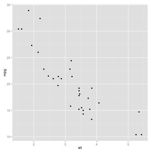
Immediately you can see a negative relationship: a higher weight means a higher miles per gallon and therefore a lower fuel efficiency in. This makes intuitive sense: a heavier car requires more fuel. But is it possible that this trend happened by chance? Maybe it just so happened that the cars we chose with heavier weights happened to have lower fuel efficiency, and vice versa, even though there was no underlying relationship.
To test that, we need more than a graph: we need to perform a statistical test. We're comparing two vectors here: the column describing the miles-per-gallon fuel efficiency of each car, and the column describing the weight in pounds. Recall that we can access a single column of the data using a dollar sign:
mtcars$mpg## [1] 21.0 21.0 22.8 21.4 18.7 18.1 14.3 24.4 22.8 19.2 17.8 16.4 17.3 15.2
## [15] 10.4 10.4 14.7 32.4 30.4 33.9 21.5 15.5 15.2 13.3 19.2 27.3 26.0 30.4
## [29] 15.8 19.7 15.0 21.4mtcars$wt## [1] 2.620 2.875 2.320 3.215 3.440 3.460 3.570 3.190 3.150 3.440 3.440
## [12] 4.070 3.730 3.780 5.250 5.424 5.345 2.200 1.615 1.835 2.465 3.520
## [23] 3.435 3.840 3.845 1.935 2.140 1.513 3.170 2.770 3.570 2.780The simplest way to test for a relationship between two variables is with a correlation test. This can be done with the cor.test function:
cor.test(mtcars$mpg, mtcars$wt)##
## Pearson's product-moment correlation
##
## data: mtcars$mpg and mtcars$wt
## t = -9.559, df = 30, p-value = 1.294e-10
## alternative hypothesis: true correlation is not equal to 0
## 95 percent confidence interval:
## -0.9338 -0.7441
## sample estimates:
##     cor
## -0.8677Just like the t-test, we produce a lot of information, so let's walk through it. Most notable is the p-value. This value reads as 1.294 times 10 to the power of negative ten- an extremely small number, smaller than one out of a billion. This is the probability that this data would appear to be this strongly correlated by chance alone. The smaller the p-value, the more significant the correlation, so here we can be very confident that a correlation exists.
We can also find the estimate of the correlation coefficient. This value varies from -1 to 1, where 1 represents a perfectly linear positive relationship, and -1 represents a perfectly linear negative relationship. 0 would indicate that the two are not correlated. These values can be extracted individually from a correlation test just like they could be from a t-test, by using a dollar sign. For example, let's save it into a variable ct.
ct = cor.test(mtcars$mpg, mtcars$wt)Now ct contains the entire correlation test.
ct##
## Pearson's product-moment correlation
##
## data: mtcars$mpg and mtcars$wt
## t = -9.559, df = 30, p-value = 1.294e-10
## alternative hypothesis: true correlation is not equal to 0
## 95 percent confidence interval:
## -0.9338 -0.7441
## sample estimates:
## cor
## -0.8677We can extract the p-value:
ct$p.value## [1] 1.294e-10Similarly, we can extract the estimate by doing $estimate:
ct$estimate## cor
## -0.8677And much like the t-test, we can get a confidence interval:
ct$conf.int
You can see by hitting "tab" after the dollar sign all the values you can extract.
Segment 3: Linear Regression
Earlier we discussed testing for a correlation, which is a good way to see if a relationship exists between two continuous variables, x and y. In our example, we were able to test whether the fuel efficiency of a car was related to its weight. But what if you want to turn this relationship into a prediction: for instance, what would be the fuel efficiency of a 4500 pound car?
We can do this by fitting a linear model, or linear regression, which is done in R with the lm function. Let's save linear model to a variable we call fit.
fit = lm(mpg ~ wt, mtcars)Here we put the formula we're testing, which is miles per gallon explained by weight (recall that the tilde (~) means "explained by").
Now we can look at the details of this fit with the summary function:
summary(fit)##
## Call:
## lm(formula = mpg ~ wt, data = mtcars)
##
## Residuals:
## Min 1Q Median 3Q Max
## -4.543 -2.365 -0.125 1.410 6.873
##
## Coefficients:
## Estimate Std. Error t value Pr(>|t|)
## (Intercept) 37.285 1.878 19.86 < 2e-16 ***
## wt -5.344 0.559 -9.56 1.3e-10 ***
## ---
## Signif. codes: 0 '***' 0.001 '**' 0.01 '*' 0.05 '.' 0.1 ' ' 1
##
## Residual standard error: 3.05 on 30 degrees of freedom
## Multiple R-squared: 0.753, Adjusted R-squared: 0.745
## F-statistic: 91.4 on 1 and 30 DF, p-value: 1.29e-10This output contains a lot of information, even more than the t-test or correlation test did. Let's look at a few parts of it. Briefly, it first shows the call that's the way that the function was called; miles per gallon explained by weight using the mtcars data. This next part summarizes the residuals: that's how much the model got each of those predictions wrong- how different the predictions were from the actual results. This table, the most interesting part, is the coefficients- this shows the actual predictors and the significance of each.
First, we have our estimate of the y-intercept: that's the hypothetical miles per gallon of a car that weighed 0 in our linear model. Then we can see the effect of the weight variable on miles per gallon. One value we're interested in is the Estimate, which estimates the slope. We also see the effect of the weight, also called the coefficient or the slope of the weight. This shows that there's a negative relationship, where increasing the weight decreases the miles per gallon. In particular, it shows that increasing the weight by 1000 pounds decreases the efficiency by 5.3 miles per gallon. This second column is called the standard error: we won't examine it today, but in short, it represents the amount of uncertainty in our estimate of the slope. The third column is called the test statistic, a mathematically relevant value that was used to compute the last column, which is the p-value, describing whether this relationship could be due to chance alone. You might notice that the p-value for weight, 1.29*10^-10, is exactly the same as it was for our earlier correlation test- that's because we're testing the same trend.
We can extract this matrix of coefficients using the coef function:
coef(summary(fit))## Estimate Std. Error t value Pr(>|t|)
## (Intercept) 37.285 1.8776 19.858 8.242e-19
## wt -5.344 0.5591 -9.559 1.294e-10From that we get a matrix. If we want to extract out just the estimates- just the y-intercept and the slope(the coefficient of weight)- we want to get just the first column of the matrix. To do that, we can save it to a matrix:
co = coef(summary(fit))Then we get the first column:
co[, 1]## (Intercept) wt
## 37.285 -5.344If we wanted to get the p-values, we would extract the fourth column:
co[, 4]## (Intercept) wt
## 8.242e-19 1.294e-10One advantage of a linear model is that it can be used not only for statistical testing, but also for prediction. This model predicts a gas mileage for each of our existing cars, using the predict function.
predict(fit)## Mazda RX4 Mazda RX4 Wag Datsun 710
## 23.283 21.920 24.886
## Hornet 4 Drive Hornet Sportabout Valiant
## 20.103 18.900 18.793
## Duster 360 Merc 240D Merc 230
## 18.205 20.236 20.450
## Merc 280 Merc 280C Merc 450SE
## 18.900 18.900 15.533
## Merc 450SL Merc 450SLC Cadillac Fleetwood
## 17.350 17.083 9.227
## Lincoln Continental Chrysler Imperial Fiat 128
## 8.297 8.719 25.527
## Honda Civic Toyota Corolla Toyota Corona
## 28.654 27.478 24.111
## Dodge Challenger AMC Javelin Camaro Z28
## 18.473 18.927 16.762
## Pontiac Firebird Fiat X1-9 Porsche 914-2
## 16.736 26.944 25.848
## Lotus Europa Ford Pantera L Ferrari Dino
## 29.199 20.343 22.481
## Maserati Bora Volvo 142E
## 18.205 22.427But these predictions aren't that useful to us, as we already have the actual gas mileage of each. What if we wanted to predict the gas mileage of a car that has a weight of, say, 4500 pounds? We could do this by adding together the intercept term and the coefficient estimate times the weight. So if we first see the summary of the fit:
summary(fit)##
## Call:
## lm(formula = mpg ~ wt, data = mtcars)
##
## Residuals:
## Min 1Q Median 3Q Max
## -4.543 -2.365 -0.125 1.410 6.873
##
## Coefficients:
## Estimate Std. Error t value Pr(>|t|)
## (Intercept) 37.285 1.878 19.86 < 2e-16 ***
## wt -5.344 0.559 -9.56 1.3e-10 ***
## ---
## Signif. codes: 0 '***' 0.001 '**' 0.01 '*' 0.05 '.' 0.1 ' ' 1
##
## Residual standard error: 3.05 on 30 degrees of freedom
## Multiple R-squared: 0.753, Adjusted R-squared: 0.745
## F-statistic: 91.4 on 1 and 30 DF, p-value: 1.29e-10We can then add together the intercept term (37.2851) and the weight coefficient (-5.3445) times our new weight, which is 4.5 thousands of pounds:
37.2851 + (-5.3445) * 4.5## [1] 13.23This predicts a fuel efficiency of 13.2 miles per gallon. This is what a linear model actually means: this is a linear combination of the intercept and the slope.
There is a shortcut for producing this value from the fit, using the predict function. First we create a data frame containing the predictors we wish to use. In this case, imagine we had a new car that weighed 4500 pounds:
newcar = data.frame(wt=4.5)Now that we have this data frame, we can do
predict(fit, newcar)## 1
## 13.24This calculates the same estimate, 13.235, predicting this car's miles per gallon using this fit.
Finally, note that we can show a linear model on our plot using a method built into ggplot2, geom_smooth. We tell it that the method to use is "lm", a linear model, the same one we've been learning.
ggplot(mtcars, aes(wt, mpg)) + geom_point() + geom_smooth(method="lm")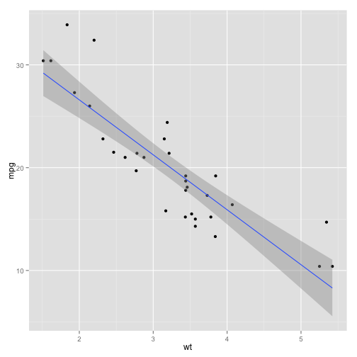
Now we get a linear trend on our ggplot. The grey area shown is the uncertainty in the fit: it's a 95% confidence interval of where the true trend line could be. It's worth noting that this is not a perfect linear fit: we can see that values both at the low end and the high end have a tendency to be higher than we would predict. Dealing with those issues is beyond the scope of this lesson.
Segment 4: Multiple Linear Regression
We've learned to use a linear model to determine significance and make predictions. But what if you have more than one predictor variable? For instance, let's say you want to measure the effect of not just weight, but also the number of cylinders, and the volume, or displacement, of the car? We can get a sense of the trend by adding those two predictors to our visualization using color and size. Here we put the number of cylinders (cyl) as the color and the volume, or displacement (disp) as the size.
ggplot(mtcars, aes(x=wt, y=mpg, col=cyl, size=disp)) + geom_point()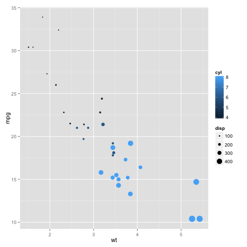
Already the effect of those three variables on the miles per gallon is kind of difficult to determine. It's true that cars with higher volume, or larger points, have a lower fuel efficiency- but they also have a higher weight. These two predictors might be redundant- or as statisticians say, confounded- for predicting the fuel efficiency. The same is true of the number of cylinders: more cylinders (or lighter blue) means both a higher weight and a lower gas mileage.
What combination of predictors will best predict fuel efficiency? Which predictors increase our accuracy by a statistically significant amount? We might be able to guess at the some of the trends from the graph, but really we want to perform a statistical test to determine which predictors are significant, and to determine the ideal formula for prediction. We do this with a multiple linear regression, where we provide multiple terms in the right side of the linear regression formula.
mfit = lm(mpg ~ wt + disp + cyl, data=mtcars)Now let's summarize this fit.
summary(mfit)##
## Call:
## lm(formula = mpg ~ wt + disp + cyl, data = mtcars)
##
## Residuals:
## Min 1Q Median 3Q Max
## -4.403 -1.403 -0.495 1.339 6.072
##
## Coefficients:
## Estimate Std. Error t value Pr(>|t|)
## (Intercept) 41.10768 2.84243 14.46 1.6e-14 ***
## wt -3.63568 1.04014 -3.50 0.0016 **
## disp 0.00747 0.01184 0.63 0.5332
## cyl -1.78494 0.60711 -2.94 0.0065 **
## ---
## Signif. codes: 0 '***' 0.001 '**' 0.01 '*' 0.05 '.' 0.1 ' ' 1
##
## Residual standard error: 2.59 on 28 degrees of freedom
## Multiple R-squared: 0.833, Adjusted R-squared: 0.815
## F-statistic: 46.4 on 3 and 28 DF, p-value: 5.4e-11Notice that the coefficient table now has four rows: one for the intercept and one for all three of our predictors. Each of these still contains the estimate of the coefficient, or slope, for that predictor. It also contains a p-values for each of the predictors independently. Notice that the p-values for weight and the number of cylinders are both significant. We can see the significance rating based on the number of stars, where ** means it's in between .001 and .01. But the p-value for displacement is not significant, This indicates that the volume of the engine is redundant with one or both of the other predictors, and provides no significant additional information.
Just like we did before, we can extract this coefficient table using the coef function:
mco = coef(summary(mfit))Once again, we can extract each of the coefficient estimates by getting the first column of this matrix.
mco[, 1]## (Intercept) wt disp cyl
## 41.107678 -3.635677 0.007473 -1.784944Here we see the four estimates: the marginal effect of increasing the weight, increasing the volume of the engine, or increasing the number of cylinders on the miles per gallon. We can also get the p-values, or the significance, of each in the fourth column.
mco[, 4]## (Intercept) wt disp cyl
## 1.620e-14 1.596e-03 5.332e-01 6.512e-03We can also predict the gas mileage of each car based on this model, by doing
predict(mfit)## Mazda RX4 Mazda RX4 Wag Datsun 710
## 22.07 21.14 26.34
## Hornet 4 Drive Hornet Sportabout Valiant
## 20.64 17.01 19.50
## Duster 360 Merc 240D Merc 230
## 16.54 23.47 23.57
## Merc 280 Merc 280C Merc 450SE
## 19.14 19.14 14.09
## Merc 450SL Merc 450SLC Cadillac Fleetwood
## 15.33 15.15 11.27
## Lincoln Continental Chrysler Imperial Fiat 128
## 10.55 10.68 26.56
## Honda Civic Toyota Corolla Toyota Corona
## 28.66 27.83 25.90
## Dodge Challenger AMC Javelin Camaro Z28
## 16.41 16.61 15.48
## Pontiac Firebird Fiat X1-9 Porsche 914-2
## 15.84 27.52 27.09
## Lotus Europa Ford Pantera L Ferrari Dino
## 29.18 17.93 21.41
## Maserati Bora Volvo 142E
## 16.10 24.76Or we can do it for a new car: all we have to do is give it the weight, displacement and number of cylinders of our hypothetical car.
newcar = data.frame(wt=4.5, disp=300, cyl=8)
newcar
## wt disp cyl
## 1 4.5 300 8We can then predict the gas mileage of this car with
predict(mfit, newcar)## 1
## 12.71