I have some experience teaching R programming (see, for instance, my Introduction to the Tidyverse course). One of the atypical choices I make is to start by teaching Hadley Wickham’s ggplot2 package, rather than the built-in R plotting.
Many times that I mention this choice to others involved in statistics education, they treat it like a mistake to teach a third-party package first- even if they themselves use ggplot2 for their own plotting. Many teachers suggest I’m overestimating their students: “No, see, my students are beginners…”. If I push the point, they might insist I’m not understanding just how much of a beginner these students are, and emphasize they’re looking to keep it simple and teach the basics, and that that students can get to the advanced methods later. The difference between basic plotting and ggplot2 is thus framed as
| built-in | ggplot2 | |
|---|---|---|
| “beginner” | vs | “expert” |
| “basic” | vs | “advanced” |
| “easy” | vs | “hard” |
| “simple” | vs | “complicated” |
My claim is that this is precisely backwards. ggplot2 is easier to teach beginners, not harder, and makes constructing plots simpler, not more complicated.
This should not be a surprise. ggplot2 aims for abstraction, where the choices the you make are the ones that matter for your visualization of the data. This is exactly what you want for beginners. In the meantime, R’s basic plotting makes you construct your graph piece by piece, often making use of more advanced constructs like loops. Besides which, the fact that something was invented first doesn’t make it more basic. The fact that these functions were written in the early 1990s doesn’t somehow guarantee that they’re suited for beginners.
Here are a few specific advantages of ggplot2 for beginners:
- With built-in plotting you have to make your own legends (using the
legendfunction). This requires at least one additional line of code, and for complex plots it requires keeping track of the variables and aesthetics you used. Every time you change your plot slightly (e.g. what each color represents), you have to change your legend as well. If you’re an experienced programmer, you’ll be able to set up lists and abstractions that make this less of an inconvenience. But it’s one more challenge for beginners. - Faceting is a great way to display data in multiple subplots, and in basic plots it is quite difficult. You have to make a call to
parto set the number of subplots, then construct a for loop to create each plot separately. (Those who have programming experience often forget how difficult loops are for beginnners). This requires programming logic that is overwhelming for beginners. - ggplot2 teaches you to work with tidy data, which is a good habit to build. R functions like
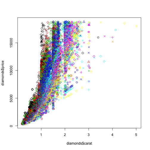
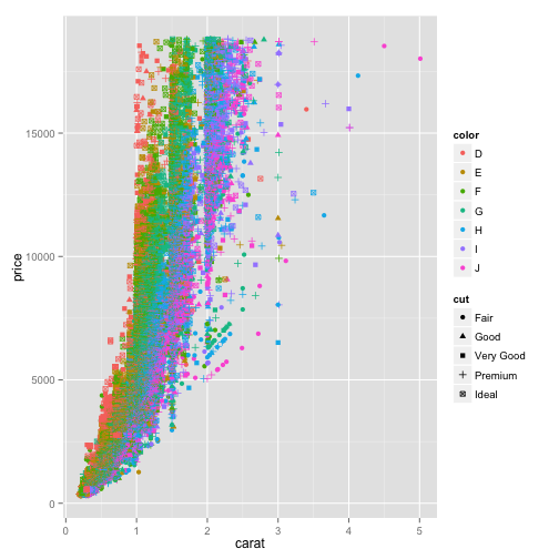
lmuse tidy data, as do exploratory data analysis packages like data.table or dplyr. - ggplot2 looks better. Just compare:
Basic Plotting
# just getting some data
library(ggplot2)
data(diamonds)

# basic plotting
plot(diamonds$carat, diamonds$price, col = diamonds$color,
    pch = as.numeric(diamonds$cut))
ggplot2
ggplot(diamonds, aes(carat, price, col = color, shape = cut)) +
    geom_point()
Why does it matter how the plot looks? Because you’re not just teaching students how to program in R, you’re teaching them that they should. Learning to program takes effort and investment, and the more compelling the figures you can create very early in the course, the more easily you can convince them it is worth the effort.
This fits into a general principle I find myself arguing over and over, which is that you should teach your students as you would have wanted to be taught. The same goes for something like knitr- even the coders I know who swear by knitr are skeptical when I teach it to beginners. But knitr is an exceptional tool for students- it makes homework assignments in particular much easier. Why should we keep it from them?
