
I recently ran into a question looking for a case study in genomics, particularly for teaching ggplot2, dplyr, and the tidy data framework developed by Hadley Wickham. There exist many great resources for learning how to analyze genomic data using Bioconductor tools, including these workflows and package vignettes. But case studies for teaching the suite of tidy tools on biological datasets are much rarer.
I realized I’d been teaching a dataset perfect for this purpose that deserved a wider audience: a gene expression dataset from Brauer et al 2008: Coordination of Growth Rate, Cell Cycle, Stress Response, and Metabolic Activity in Yeast. I’ve taught this dataset in several classes, and always been impressed with how it can both communicate concepts of tidy data analysis and visualization and tell a rich biological story.
So here (across a couple of posts) I’m going to show an end-to-end analysis of a gene expression dataset according to tidy data principles. We’ll use bioinformatics tools from Bioconductor when appropriate, but will focus on the suite of tidy tools.
While the content of this series is going to be interesting mostly to biologists and geneticists, I’ve made an effort to provide explanations so that anyone interested in tidy data analysis can follow. I’m going to assume that the reader is familiar with the absolute basics of the dplyr and ggplot2 packages, especially the %>% operator. (If not, here’s a good set of tutorials).
Background: gene expression in starvation
Through the process of gene regulation, a cell can control which genes are transcribed from DNA to RNA- what we call being “expressed”. (If a gene is never turned into RNA, it may as well not be there at all). This provides a sort of “cellular switchboard” that can activate some systems and deactivate others, which can speed up or slow down growth, switch what nutrients are transported into or out of the cell, and respond to other stimuli. A gene expression microarray lets us measure how much of each gene is expressed in a particular condition. We can use this to figure out the function of a specific gene (based on when it turns on and off), or to get an overall picture of the cell’s activity.
Brauer 2008 used microarrays to test the effect of starvation and growth rate on baker’s yeast (S. cerevisiae, a popular model organism for studying molecular genomics because of its simplicity)1. Basically, if you give yeast plenty of nutrients (a rich media), except that you sharply restrict its supply of one nutrient, you can control the growth rate to whatever level you desire (we do this with a tool called a chemostat). For example, you could limit the yeast’s supply of glucose (sugar, which the cell metabolizes to get energy and carbon), of leucine (an essential amino acid), or of ammonium (a source of nitrogen).
“Starving” the yeast of these nutrients lets us find genes that:
- Raise or lower their activity in response to growth rate. Growth-rate dependent expression patterns can tell us a lot about cell cycle control, and how the cell responds to stress.
- Respond differently when different nutrients are being limited. These genes may be involved in the transport or metabolism of those nutrients.
Sounds pretty cool, right? So let’s get started!
Tidying data with dplyr and tidyr
You can download the original gene expression dataset here, or just run the following R code (you’ll need the readr package installed)2:
library(readr)
original_data <- read_delim("http://varianceexplained.org/files/Brauer2008_DataSet1.tds", delim = "\t")
This is the exact data that was published with the paper (though for some reason the link on the journal’s page is now broken). It thus serves as a good example of tidying a biological dataset “found in the wild.”
Let’s take a look at the data:
View(original_data)dim(original_data)## [1] 5537 40
Each of those columns like G0.05, N0.3 and so on represents gene expression values for that sample, as measured by the microarray. The column titles show the condition: G0.05, for instance, means the limiting nutrient was glucose and the growth rate was .05. A higher value means the gene was more expressed in that sample, lower means the gene was less expressed. In total the yeast was grown with six limiting nutrients and six growth rates, which makes 36 samples, and therefore 36 columns, of gene expression data.
Before we do any analysis, we’re going to need to tidy this data, as described in Wickham’s “Tidy Data” paper (especially p5-13). Tidy data follows these rules:
- Each variable forms a column.
- Each observation forms a row.
- Each type of observational unit forms a table.
What is “untidy” about this dataset?
- Column headers are values, not variable names. Our column names contain the values of two variables: nutrient (G, N, P, etc) and growth rate (0.05-0.3). For this reason, we end up with not one observation per row, but 36! This is a very common issue in biological datasets: you often see one-row-per-gene and one-column-per-sample, rather than one-row-per-gene-per-sample.
-
Multiple variables are stored in one column. The
NAMEcolumn contains lots of information, split up by||’s. If we examine one of the names, it looks likeSFB2 || ER to Golgi transport || molecular function unknown || YNL049C || 1082129
which seems to have both some systematic IDs and some biological information about the gene. If we’re going to use this programmatically, we need to split up the information into multiple columns.
The more effort you put up front into tidying your data, the easier it will be to explore interactively. Since the analysis steps are where you’ll actually be answering questions about your data, it’s worth putting up this effort!
Multiple variables are stored in one column
Let’s take a closer look at that NAME column.
original_data$NAME[1:3]## [1] "SFB2 || ER to Golgi transport || molecular function unknown || YNL049C || 1082129"
## [2] "|| biological process unknown || molecular function unknown || YNL095C || 1086222"
## [3] "QRI7 || proteolysis and peptidolysis || metalloendopeptidase activity || YDL104C || 1085955"The details of each of these fields isn’t annotated in the paper, but we can figure out most of it. It contains:
- Gene name e.g. SFB2. Note that not all genes have a name.
- Biological process e.g. “proteolysis and peptidolysis”
- Molecular function e.g. “metalloendopeptidase activity”
- Systematic ID e.g. YNL049C. Unlike a gene name, every gene in this dataset has a systematic ID.3
- Another ID number e.g. 1082129. I don’t know what this number means, and it’s not annotated in the paper. Oh, well.
Having all give of these in the same column is very inconvenient. For example, if I have another dataset with information about each gene, I can’t merge the two. Luckily, the tidyr package provides the separate function for exactly this case.
library(dplyr)
library(tidyr)

cleaned_data <- original_data %>%
  separate(NAME, c("name", "BP", "MF", "systematic_name", "number"), sep = "\\|\\|")
We simply told separate what column we’re splitting, what the new column names should be, and what we were separating by. What does the data look like now?
View(cleaned_data)
Just like that, we’ve separated one column into five.
Two more things. First, when we split by ||, we ended up with whitespace at the start and end of some of the columns, which is inconvenient:
head(cleaned_data$BP)## [1] " ER to Golgi transport " " biological process unknown "
## [3] " proteolysis and peptidolysis " " mRNA polyadenylylation* "
## [5] " vesicle fusion* " " biological process unknown "We’ll solve that with dplyr’s mutate_each, along with the built-in trimws (“trim whitespace”) function.
cleaned_data <- original_data %>%
  separate(NAME, c("name", "BP", "MF", "systematic_name", "number"), sep = "\\|\\|") %>%
  mutate_each(funs(trimws), name:systematic_name)
Finally, we don’t even know what the number column represents (if you can figure it out, let me know!) And while we’re at it, we’re not going to use the GID, YORF or GWEIGHT columns in this analysis either. We may as well drop them, which we can do with dplyr’s select.
cleaned_data <- original_data %>%
  separate(NAME, c("name", "BP", "MF", "systematic_name", "number"), sep = "\\|\\|") %>%
  mutate_each(funs(trimws), name:systematic_name) %>%
  select(-number, -GID, -YORF, -GWEIGHT)
Column headers are values, not variable names
Let’s take a closer look at all those column headers like G0.05, N0.2 and P.15.
- Limiting nutrient. This has six possible values: glucose (G), ammonium (N), sulfate (S), phosphate (P), uracil (U) or leucine (L).
- Growth rate: A number, ranging from .05 to .3. .05 means slow growth (the yeast were being starved hard of that nutrient) while .3 means fast growth. (Technically, this value measures the dilution rate from the chemostat).
- Expression level. These are the values currently stored in those columns, as measured by the microarray. (Note that the paper already did some pre-processing and normalization on these values, which we’re ignoring here).
The rules of tidy data specify that each variable forms one column, and this is not even remotely the case- we have 36 columns when we should have 3. That means our data is trapped in our column names. If you don’t see why this is a problem, consider: how would you put growth rate on the x-axis of a graph? How would you filter to look only the glucose condition?
Luckily, the tidyr package has a solution ready. The documentation for gather notes (emphasis mine):
Gather takes multiple columns and collapses into key-value pairs, duplicating all other columns as needed. You use
gather()when you notice that you have columns that are not variables.
Hey, that’s us! So let’s apply gather as our next step:
cleaned_data <- original_data %>%
  separate(NAME, c("name", "BP", "MF", "systematic_name", "number"), sep = "\\|\\|") %>%
  mutate_each(funs(trimws), name:systematic_name) %>%
  select(-number, -GID, -YORF, -GWEIGHT) %>%
  gather(sample, expression, G0.05:U0.3)
Now when we view it, it looks like:
View(cleaned_data)
Notice that the dataset no longer consists of one-row-per-gene: it’s one-row-per-gene-per-sample. This has previously been called “melting” a dataset, or turning it into “long” format. But I like the term “gather”: it shows that we’re taking these 36 columns and pulling them together.
One last problem. That sample column really contains two variables, nutrient and rate. We already learned what to do when we have two variables in one column: use separate:
library(dplyr)
library(tidyr)
library(stringr)

cleaned_data <- original_data %>%
  separate(NAME, c("name", "BP", "MF", "systematic_name", "number"), sep = "\\|\\|") %>%
  mutate_each(funs(trimws), name:systematic_name) %>%
  select(-number, -GID, -YORF, -GWEIGHT) %>%
  gather(sample, expression, G0.05:U0.3) %>%
  separate(sample, c("nutrient", "rate"), sep = 1, convert = TRUE)
This time, instead of telling separate to split the strings based on a particular delimiter, we told it to separate it after the first character (that is, after G/P/S/N/L/U). We also told it convert = TRUE to tell it that it should notice the 0.05/0.1/etc value is a number and convert it.
Take a look at those six lines of code, a mini-sonnet of data cleaning. Doesn’t it read less like code and more like instructions? (“First we separated the NAME column into its five parts, and trimmed each. We selected out columns we didn’t need…”) That’s the beauty of the %>% operator and the dplyr/tidyr verbs.
Why keep this data tidy? Visualization with ggplot2
So we went through this effort to get this dataset into this structure, and you’re probably wondering why. In particular, why did we have to bother gathering those expression columns into one-row-per-gene-per-sample?
Well, suppose we have a single yeast gene we’re interested in. Let’s say LEU1, a gene involved in the leucine synthesis pathway.
cleaned_data %>%
  filter(name == "LEU1") %>%
  View()
We now have 36 data points (six conditions, six growth rates), and for each we have a limiting nutrient, a growth rate, and the resulting expresion. We’re probably interested in how both the growth rate and the limiting nutrient affect the gene’s expression.
36 points is too many to look at manually. So it’s time to bring in some visualization. To do that, we simply pipe the results of our filtering right into ggplot2:
library(ggplot2)

cleaned_data %>%
  filter(name == "LEU1") %>%
  ggplot(aes(rate, expression, color = nutrient)) +
  geom_line()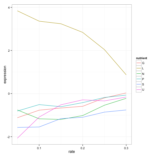
What a story this single gene tells! The gene’s expression is far higher (more “turned on”) when the cell is being starved of leucine than in any other condition, because in that case the cell has to synthesize its own leucine. And as the amount of leucine in the environment (the growth rate) increases, the cell can focus less on leucine production, and the expression of those genes go down. We’ve just gotten one snapshot of our gene’s regulatory network, and how it responds to external stimuli.
We don’t have to choose one gene to visualize- LEU1 is just one gene in the leucine biosynthesis process. Recall that we have that information in the BP column, so we can filter for all genes in that process, and then facet to create sub-plots for each.
cleaned_data %>%
  filter(BP == "leucine biosynthesis") %>%
  ggplot(aes(rate, expression, color = nutrient)) +
  geom_line() +
  facet_wrap(~name)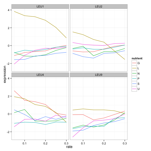
LEU1, LEU2, and LEU4 all show a similar pattern, where starvation of leucine causes higher gene expression. (Interestingly, LEU4 responds to glucose starvation as well. Any geneticists have some idea why?). LEU9 is a little more ambiguous but is still highest expressed under leucine starvation. We already know what these genes do, but this hints at how we might be able to find other genes that are involved in leucine synthesis, including ones we don’t yet know.
Let’s play with graph a little more. These trends look vaguely linear. Maybe we should show best points with best fit lines instead:
cleaned_data %>%
  filter(BP == "leucine biosynthesis") %>%
  ggplot(aes(rate, expression, color = nutrient)) +
  geom_point() +
  geom_smooth(method = "lm", se = FALSE) +
  facet_wrap(~name)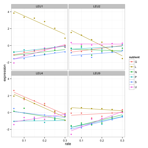
The options for exploratory data analysis are endless. We could instead look at sulfur metabolism:
cleaned_data %>%
  filter(BP == "sulfur metabolism") %>%
  ggplot(aes(rate, expression, color = nutrient)) +
  geom_point() +
  geom_smooth(method = "lm", se = FALSE) +
  facet_wrap(~name + systematic_name, scales = "free_y")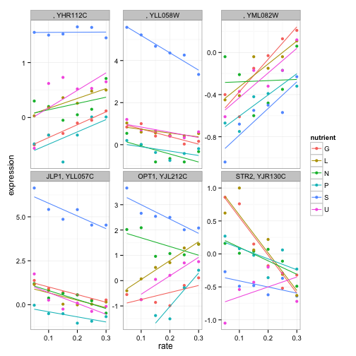
(Notice that we have to facet by the systematic_name here, since not all genes in this process have traditional names).
If you were an interested molecular biologist, you could go a long way just by examining various biological processes, or looking at lists of genes you were interested in. This is a great way to explore a dataset interactively, and to hint at methods of further analysis. For example, we notice that we can fit linear models to many of these expression profiles- that will come in handy in the next post:
Conclusion: specific data, generalized tools
I earlier pointed to a list of available workflows from Bioconductor, which teach ways to analyze many kinds of genomic data using packages specialized for those purposes. These kinds of guides are incredibly valuable, and Bioconductor has built up an excellent set of tools for analyzing genomic data, many of which come with their own data processing and visualization methods.
So why bother teaching a dplyr/ggplot2 approach? Because these tools are useful everywhere. Consider the dozen lines of code we used to clean and visualize our data:
library(dplyr)
library(tidyr)
library(ggplot2)

cleaned_data <- original_data %>%
  separate(NAME, c("name", "BP", "MF", "systematic_name", "number"), sep = "\\|\\|") %>%
  mutate_each(funs(trimws), name:systematic_name) %>%
  select(-number, -GID, -YORF, -GWEIGHT) %>%
  gather(sample, expression, G0.05:U0.3) %>%
  separate(sample, c("nutrient", "rate"), sep = 1, convert = TRUE)

cleaned_data %>%
  filter(BP == "leucine biosynthesis") %>%
  ggplot(aes(rate, expression, color = nutrient)) +
  geom_point() +
  geom_smooth(method = "lm", se = FALSE) +
  facet_wrap(~name)
With this code we’re able to go from published data to a new conclusion about leucine biosynthesis (or sulfate metabolism, or whatever biological process or genes we’re interested in). But the functions we use aren’t specific to our dataset or data format: in fact, they’re not related to biology at all. Instead, these tools are building blocks, or “atoms,” in a grammar of data manipulation and visualization that applies to nearly every kind of data.
In June 2015 I finished my PhD in computational biology and joined Stack Overflow as a data scientist. People sometimes ask me whether it was difficult to switch my focus away from biology. But I found that my experience was almost equally applicable to data science on a website, because I’d been working with dplyr, ggplot2 and other tidy tools and performing analyses like the one in this post. If I’d instead limited myself to specialized tools that looked something like:
library(brauerAnalyze)

cleaned_data <- read_brauer_data("http://varianceexplained.org/files/Brauer2008_DataSet1.tds")
plot_biological_process(cleaned_data, "leucine biosynthesis")
Then I might have gotten that task done in fewer lines of code, but I wouldn’t have learned to approach new datasets in the future.
This isn’t meant to disparage Bioconductor in any way: scientists should use whatever tool gets their job done. But educators can and should focus on teaching tools that can be universally applied. In turn, students can take these tools and build new packages, for Bioconductor and elsewhere, that analyze novel forms of data.
Next time
You’ll probably agree that the above analysis gives a compelling case for keeping your data in a tidy format (one-row-per-gene-per-sample) when it comes to making plots. (Just try creating the above “leucine biosynthesis” plot without first tidying the data- it is a hassle, and especially impossible in ggplot2).
But graphing is nothing special. Almost everything- from exploratory analysis to modeling to parallelization- is easier when your data is structured according to tidy data principles. In future posts, I’ll show how to perform per-gene linear regressions with broom, use GO term enrichment to find functional groups of genes that show differential expression, and many other tidy analyses.
Footnotes
-
What do I mean by simplicity? It has a small genome size (12 million bp), relatively few genes (~6000), and virtually no introns or splicing. That’s a good thing because when we’re studying a molecular function, we like to go with the simplest possible organism that still shares that functionality. (Bacteria are even simpler, but because they’re prokaryotes their molecular systems are wildly different from both yeasts and humans). For instance, much of what we know about the cell cycle and mitosis largely comes from yeast, because yeast cells divide a lot like ours do. ↩
-
You could also use the built-in
read.delimfunction: readr is merely convenient because it returns atbl_dfobject (from dplyr) that is easier to print. It also setsstringsAsFactorsto false by default, which is generally good news. ↩ -
Systematic IDs aren’t great for biological interpretation (no one says “oh, I know gene YNL049C, that’s my favorite!”), but they’re awesome when we want to link across datasets unambiguously. ↩