
I spend a good amount of time on the programming Q+A site StackOverflow (and a smaller amount of time on its statistics sister site, Cross Validated). Recently this question on Meta Stack Overflow (the website’s discussion forum) caught my attention, raising the question of whether Stack Overflow had become “more negative” recently. It wasn’t the first time that I’d heard suggestions of this nature, but due to recency bias I’m cautious of turning a complaint (“I don’t like X”) into trends (“kids these days with their X”). In particular, the fact that people were noticing the exact same “trend” in September 2008 would appear to confirm that it’s not a recent phenomenon.
But this answer in particular struck me, as it suggested a simple, specific and testable hypothesis regarding the supposed decline of Stack Overflow: that high-reputation users are starting to quit the site. (“Reputation” is a measure of trust within the Stack Overflow community achieved by receiving upvotes on your questions and answers, so high-reputation users are those who had answered many questions- a mass exodus of such users would indeed be worrisome). As the answer was provided by one of the most prolific answerers on Stack Overflow, it seemed like it deserved consideration.
Luckily, the Stack Exchange network has made an exceptional resource available to data scientists: the Stack Exchange Data Explorer, which lets anyone query information about the history of users and posts. So I constructed a dataset of the number of Stack Overflow answers per user per month since January 2012, for all users with reputation >= 20000, using this query [1].
library(data.table)
answers.raw = as.data.table(read.csv("input/highrep_user_answers_per_month.csv"))

# We need to remove the current month (not over yet)
answers = answers.raw[!(Year == 2014 & Month == 12)]
answers$Date = as.Date(paste(answers$Year, answers$Month, 15, sep="-"))
answers$Count = as.numeric(answers$Count)
This covers a total of 65902 answers from 2792 users. With this dataset, we can take a look at whether high-reputation users are in fact quitting the site.
Overall Statistics
First, we can ask: as a whole, are >20K rep users contributing fewer questions than they used to?
library(ggplot2)

answers.overall = answers[, list(Answers=sum(Count)), by=c("Date")]
ggplot(answers.overall, aes(Date, Answers)) + geom_line() +
    geom_smooth(method="loess") +
    theme(axis.text.x = element_text(angle = 45, hjust = 1))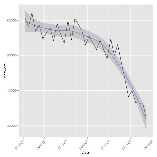
The answer is a definitive yes: answers contributed by these high-rep users decreased by about 50% from January 2012 to November 2014. Furthermore, the sharpest decline (of 40%) was in the last year.
Exponential Model
Now we might ask whether this is trend is split across all users equally: is this a general but gradual malaise among all high-reputation users, or is there a special class of “quitters” that could be “blamed” for the decrease? Furthermore, are there many high-rep users that are bucking the trend and are increasing their contributions over time? To determine this, I perform a quasipoisson generalized linear model predicting the number of questions/month as exponentially growing or decaying over time 2. This gets us a p-value for each user, testing whether there is a trend over time 3:
library(MASS)

# treat date as the number of months since 1/15/2012
answers$MonthNumber = (answers$Year - 2012) * 12 + answers$Month - 1

library(broom)
users.qp.tests.raw = answers[, cbind(tidy(glm(Count ~ MonthNumber,
                                              family="quasipoisson")),
                                     Answers=sum(Count)),
                             by=c("Id", "DisplayName", "Reputation")]
users.qp.tests.raw = users.qp.tests.raw[term != "(Intercept)"]

users.qp.tests = users.qp.tests.raw[!is.nan(p.value) & !is.na(p.value)]
users.qp.tests = users.qp.tests[round(p.value, 6) != 1]
users.qp.tests$halflife = log(2) / (users.qp.tests$estimate)library(ggplot2)
qplot(users.qp.tests$p.value, binwidth=.05, xlab="P-value of Trend Over Time")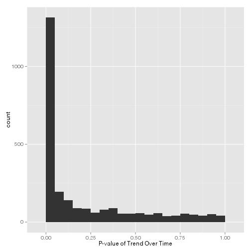
library(qvalue)
users.qp.tests$qvalue = qvalue(users.qp.tests$p.value)$qvalue
significant.users = users.qp.tests[qvalue < .05]
We can control the false discovery rate using our favorite multiple hypothesis testing tool (in my case, the q-value package), which gets us a set of 1478 users (56% of all high-rep users) that have a statistically significant trend with respect to time, at a false discovery rate of 5%.
Statistical significance only tells us so much. Of those users with a significant trend over time, how many users increased their activity, and how many decreased it? And how quickly did it change in each case?
ggplot(significant.users, aes(exp(estimate)-1)) +
    geom_histogram(binwidth=.015) +
    labs(x="exp(Rate)-1=% increase/decrease per month", col="Significant at 5% FDR")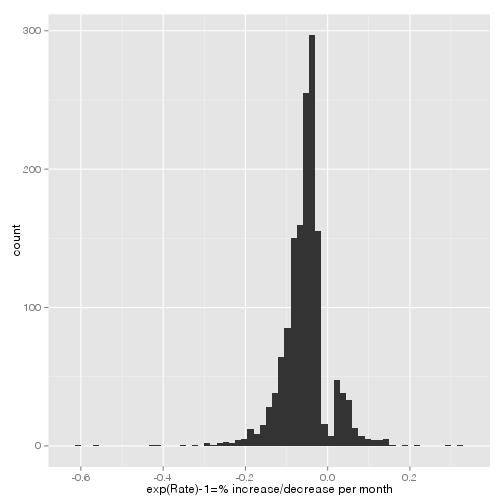
(See How to interpret a p-value histogram for more about how to understand this kind of plot). Of these 1478 users whose activity was changing over time, 88.6% were decreasing (what we could call “quitters”), and only 11.4% were increasing (what we could call “joiners”). What we see here is the percentage change predicted for each user per month (for example, the mode “quitter” shows a rate of ~5% decline per month). We could also view it as the doubling time/half life. In this plot, positive values represent the number of months required for a “joiner” to double his activity, and negative values represent the number of months for a “quitter” to halve his:
users = answers[, list(Answers=sum(Count)), by=c("Id", "Reputation")]
ggplot(significant.users, aes(halflife)) + geom_histogram()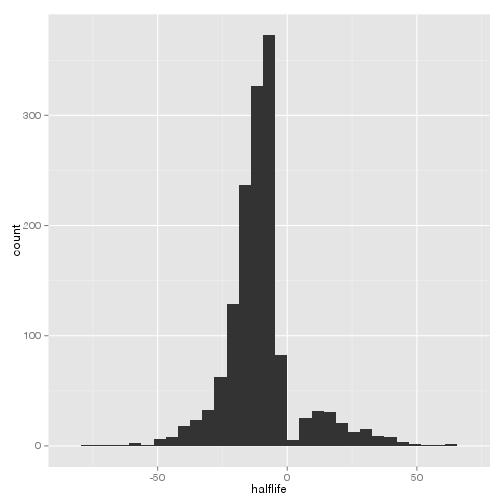
Now, we’ve identified a class of statistically significant “quitters” (1309 users) and “joiners” (169 users). Do these users account for the trend we saw in our original figure? Well, let’s divide the original figure up into categories:
users.qp.tests = users.qp.tests[,
    Category:=ifelse(qvalue > .05, "Other",
                     ifelse(estimate < 0, "Quitters", "Joiners"))]

answers$Category = users.qp.tests$Category[match(answers$Id, users.qp.tests$Id)]
answers$Category[is.na(answers$Category)] = "Other"

ggplot(answers[, list(Answers=sum(Count)), by=c("Date", "Category")],
       aes(Date, Answers, col=Category)) + geom_line() +
    theme(axis.text.x = element_text(angle = 45, hjust = 1))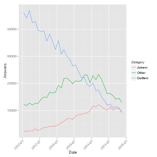
This set of users does make up for the overall downward trend. However, it’s notable that there’s another trend visible among those who didn’t fit this model: one that increases activity during 2012, stays steady in 2013, and then decreases activity more recently (we could call them the “late quitters”). This second trend deserves further study in any future analysis.
Individual Users
What do the trends of the top users look like? (This is not to “call them out,” but rather to see whether the assumptions of our model are appropriate for detecting trends):
plot.users = function(uids) {
    subdat = answers[Id %in% uids]
    # order based on order of uids given
    subdat$DisplayName = reorder(subdat$DisplayName, match(subdat$Id, uids))
    ret = ggplot(subdat, aes(Date, Count)) + geom_line()
    ret = ret + facet_wrap(~ DisplayName, scale="free_y")
    ret = ret + theme(axis.text.x = element_text(angle = 45, hjust = 1))
    ret = ret + geom_smooth(method="glm", family="quasipoisson")
    ret
}
top.users = head(users.qp.tests[order(-Reputation)]$Id, 12)
plot.users(top.users)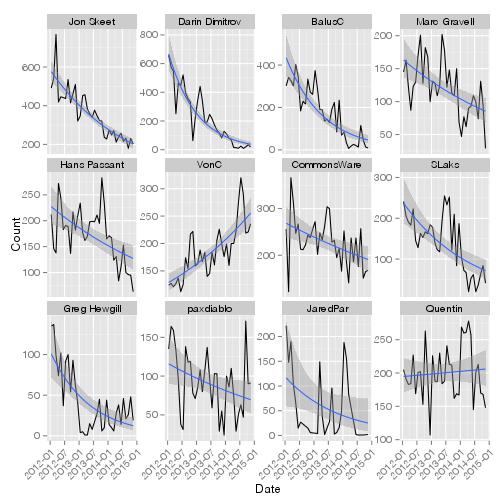
Of the top 12 users, 1 was increasing in activity in the last two years, while 10 were decreasing (the last did not show a statistically significant trend). Now, I’m far from a top user, but one might ask how I fit in:
plot.users("712603")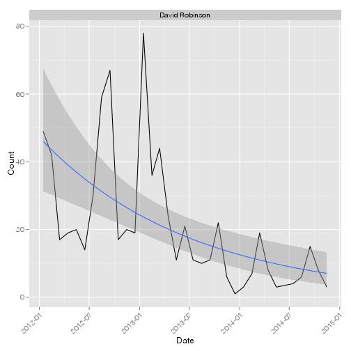
I do in fact have a significant negative trend (q-value = 0.00045748), though we can see there’s a high amount of overdispersion. I’m not sure I could explain why through introspection (I’m guessing I just had less time to spend answering questions). But I would be interested in hearing from any former power users whose activity has decreased, and whether it was some perceived issue with Stack Overflow that led to this decline in activity.
(A version of this analysis was originally posted as a Meta Stack Overflow answer).
[1]: Why these choices? First, 20000 is the level designated by Stack Overflow as a “Trusted User”, the highest level of privilege granted by reputation. Second, I was testing the hypothesis of a recent exodus in SO high-rep users, so it didn’t make sense to look beyond the last three years. Finally, I have started answering myself in January 2012, and have about 30K rep, so I was interested in seeing where I fit into the pattern!