
Previously in this series
- Understanding the beta distribution (using baseball statistics)
- Understanding empirical Bayes estimation (using baseball statistics)
In my last post, I explained the method of empirical Bayes estimation, a way to calculate useful proportions out of many pairs of success/total counts (e.g. 0/1, 3/10, 235/1000). I used the example of estimating baseball batting averages based on \(x\) hits in \(n\) opportunities. If we run into a player with 0 hits in 2 chances, or 1 hit in 1 chance, we know we can’t trust it, and this method uses information from the overall distribution to improve our guess. Empirical Bayes gives a single value for each player that can be reliably used as an estimate.
But sometimes you want to know more than just our “best guess,” and instead wish to know how much uncertainty is present in our point estimate. We normally would use a binomial proportion confidence interval (like a margin of error in a political poll), but this does not bring in information from our whole dataset. For example, the confidence interval for someone who hits 1 time out of 3 chances is \((0.008, 0.906)\). We can indeed be quite confident that that interval contains the true batting average… but from our knowledge of batting averages, we could have drawn a much tighter interval than that! There’s no way that the player’s real batting average is .1 or .8: it probably lies in the .2-.3 region that most other players’ do.
Here I’ll show how to compute a credible interval using empirical Bayes. This will have a similar improvement relative to confidence intervals that the empirical Bayes estimate had to a raw batting average.
Setup
I’ll start with the same code from the last post, so that you can follow along in R if you like.
library(dplyr)
library(tidyr)
library(Lahman)
career <- Batting %>%
filter(AB > 0) %>%
anti_join(Pitching, by = "playerID") %>%
group_by(playerID) %>%
summarize(H = sum(H), AB = sum(AB)) %>%
mutate(average = H / AB)
career <- Master %>%
tbl_df() %>%
select(playerID, nameFirst, nameLast) %>%
unite(name, nameFirst, nameLast, sep = " ") %>%
inner_join(career, by = "playerID")
career_filtered <- career %>% filter(AB >= 500)
m <- MASS::fitdistr(career_filtered$average, dbeta,
start = list(shape1 = 1, shape2 = 10))
alpha0 <- m$estimate[1]
beta0 <- m$estimate[2]
career_eb <- career %>%
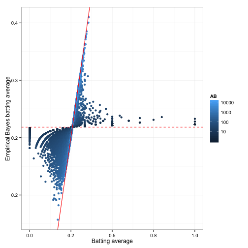
mutate(eb_estimate = (H + alpha0) / (AB + alpha0 + beta0))The end result of this process is the eb_estimate variable. This gives us a new value for each proportion; what statisticians call a point estimate. Recall that these new values tend to be pushed towards the overall mean (giving this the name “shrinkage”):
This shrunken value is generally more useful than the raw estimate: we can use it to sort our data, or feed it into another analysis, without worrying too much about the noise introduced by low counts. But there’s still uncertainty in the empirical Bayes estimate, and the uncertainty is very different for different players. We may want not only a point estimate, but an interval of possible batting averages: one that will be wide for players we know very little about, and narrow for players with more information. Luckily, the Bayesian approach has a method to handle this.
Posterior distribution
Consider that what we’re really doing with empirical Bayes estimation is computing two new values for each player: \(\alpha_1\) and \(\beta_1\). These are the posterior shape parameters for each distribution, after the prior (estimated on the whole dataset) has been updated.
career_eb <- career_eb %>%
    mutate(alpha1 = H + alpha0,
           beta1 = AB - H + beta0)
We can visualize this posterior distribution for each player. I’m going to pick a few of my favorites from the 1998 Yankee lineup.
yankee_1998 <- c("brosisc01", "jeterde01", "knoblch01", "martiti02", "posadjo01", "strawda01", "willibe02")

yankee_1998_career <- career_eb %>%
    filter(playerID %in% yankee_1998)

library(broom)
library(ggplot2)

yankee_beta <- yankee_1998_career %>%
    inflate(x = seq(.18, .33, .0002)) %>%
    ungroup() %>%
    mutate(density = dbeta(x, alpha1, beta1))

ggplot(yankee_beta, aes(x, density, color = name)) +
    geom_line() +
    stat_function(fun = function(x) dbeta(x, alpha0, beta0),
                  lty = 2, color = "black")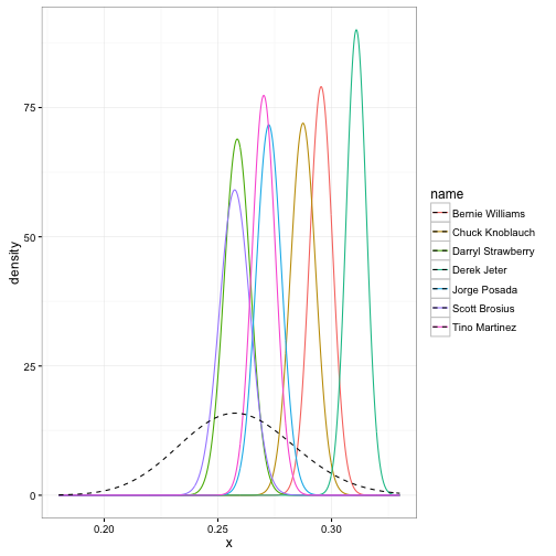
The prior is shown as a dashed curve. Each of these curves is our probability distribution of what the player’s batting average could be, after updating based on that player’s performance. That’s what we’re really estimating with this method: those posterior beta distributions.
Credible intervals
These density curves are hard to interpret visually, especially as the number of players increases, and it can’t be summarized into a table or text. We’d instead prefer to create a credible interval, which says that some percentage (e.g. 95%) of the posterior distribution lies within an particular region. Here’s Derek Jeter’s credible interval:
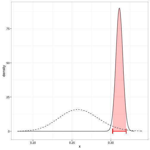
You can compute the edges of the interval quite easily using the qbeta (quantile of beta) function in R. We just provide it the posterior alpha1 and beta1 parameters:
yankee_1998_career <- yankee_1998_career %>%
    mutate(low  = qbeta(.025, alpha1, beta1),
           high = qbeta(.975, alpha1, beta1))
This results in the table:
yankee_1998_career %>%
    select(-alpha1, -beta1, -eb_estimate) %>%
knitr::kable()| playerID | name | H | AB | average | low | high |
|---|---|---|---|---|---|---|
| brosisc01 | Scott Brosius | 1001 | 3889 | 0.257 | 0.244 | 0.271 |
| jeterde01 | Derek Jeter | 3316 | 10614 | 0.312 | 0.302 | 0.320 |
| knoblch01 | Chuck Knoblauch | 1839 | 6366 | 0.289 | 0.277 | 0.298 |
| martiti02 | Tino Martinez | 1925 | 7111 | 0.271 | 0.260 | 0.280 |
| posadjo01 | Jorge Posada | 1664 | 6092 | 0.273 | 0.262 | 0.283 |
| strawda01 | Darryl Strawberry | 1401 | 5418 | 0.259 | 0.247 | 0.270 |
| willibe02 | Bernie Williams | 2336 | 7869 | 0.297 | 0.286 | 0.305 |
I usually like to view intervals in a plot like this:
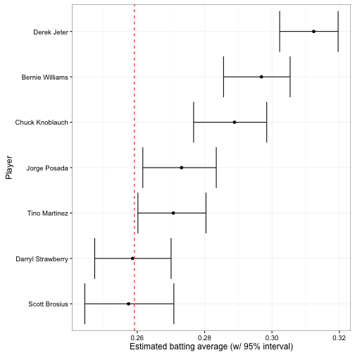
The vertical dashed red line is \(\frac{\alpha_0}{\alpha_0 + \beta_0}\): the mean batting average across history (based on our beta fit). The earlier plot showing each posterior beta distribution communicated more information, but this is far more readable.
Credible intervals versus confidence intervals
Note that posterior credible intervals are similar to frequentist confidence intervals, but they are not the same thing. There’s a philosophical difference, in that frequentists treat the true parameter as fixed while Bayesians treat it as a probability distribution. Here’s one great explanation of the distinction.
But there’s also a very practical difference, in that credible intervals take prior information into account. If I take 20 random players and construct both confidence intervals (specifically a binomial proportion confidence interval) and posterior credible intervals for each, it could look something like this:
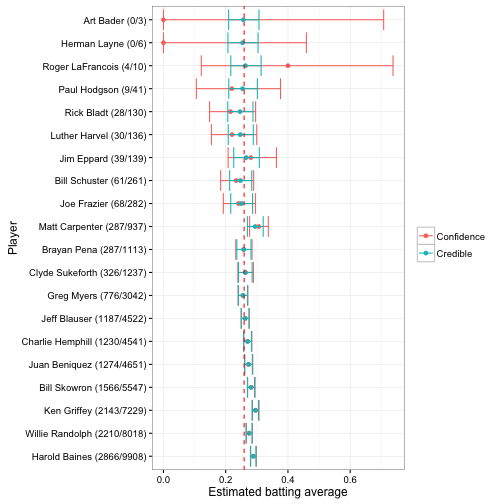
These are sorted in order of how many times a player went up to bat (thus, how much information we have about them). Notice that once there’s enough information, the credible intervals and confidence intervals are nearly identical. But for the 0/3 and 0/6 cases, the credible interval is much narrower. This is because empirical Bayes brings in our knowledge from the full data, just as it did for the point estimate.
Like most applied statisticians, I don’t consider myself too attached to the Bayesian or frequentist philosophies, but rather use whatever method is useful for a given situation. But while I’ve seen non-Bayesian approaches to point estimate shrinkage (James-Stein estimation being the most famous example), I haven’t yet seen a principled way of shrinking confidence intervals. This makes empirical Bayes posteriors pretty useful!
What’s next: Batting Hall of Fame
We now have a credible interval for each player, including lower and upper bounds for their batting average. What if you’re collecting players for a “hall of fame”, and you want to find batters that have an average greater than a particular threshold (e.g. greater than .3)? Or forget about baseball: you could be working with genes to test if they’re associated with a disease, and want to collect a set for further study. Or you could be working with advertisements on your site, and want to examine those that are performing especially well or poorly. This is the problem of hypothesis testing.
In my next post in this series about empirical Bayes and baseball, I’ll use the posterior distributions we’ve created to define Bayesian classifiers (the (rough) equivalent to frequentist hypothesis testing), and come up with a “hall of fame” of batters while managing the multiple hypothesis testing problems. I’ll also show how you can compare two batters to see if one is better than the other.
Appendix: Connection between confidence and credible intervals
(Note: This appendix is substantially more technical than the rest of the post, and is not necessary for understanding and implementing the method).
Above I mention that credible intervals are not the same thing as confidence intervals and do not necessarily provide the same information.
But in fact, two of the methods for constructing frequentist confidence intervals, Clopper-Pearson (the default in R’s binom.test function, shown in the plot above) and Jeffreys, actually use the quantiles of the Beta distribution in very similar ways, which is the reason credible and confidence intervals start looking identical once there’s enough information. You can find the formulae here. Here they are for comparison, again using the qbeta function in R:
| Method | Low | High |
|---|---|---|
| Bayesian credible interval | qbeta(.025, alpha0 + x, beta0 + n - x) |
qbeta(.975, alpha0 + x, beta0 + n - x) |
| Jeffreys | qbeta(.025, 1 / 2 + x, 1 / 2 + n - x) |
qbeta(.975, 1 / 2 + x, 1 / 2 + n - x) |
| Clopper-Pearson | qbeta(.025, x, n - x + 1) |
qbeta(.975, x + 1, n - x) |
Notice that the Jeffreys prior is identical to the Bayesian credible interval when \(\alpha_0=\frac{1}{2};\beta_0=\frac{1}{2}\). This is called an uninformative prior or a Jeffreys prior, and is basically pretending that we know nothing about batting averages. The Clopper-Pearson interval is a bit odder, since its priors are different for the lower and upper bounds (and in fact neither is a proper prior, since \(\alpha_0=0\) for the low bound and \(\beta_0=0\) for the high bound, both illegal for the beta). This is because Clopper-Pearson is actually derived from quantiles of the cumulative binomial distribution (see here!), and is simply equivalent to beta through a neat mathematical trick. What matters is this makes it more conservative (wider) than the Jeffrey’s prior, with a lower lower bound and a higher upper bound.
Most important is that the Bayesian credible interval, the Clopper-Pearson interval, and the Jeffreys interval all start looking more and more identical when:
- the evidence is more informative (large \(n\)), or
- the prior is less informative (small \(\alpha_0\), small \(\beta_0\))
This fits what we saw in the graph above. Bayesian methods are especially helpful (relative to frequentist methods) when the prior makes up a large share of the information.
It is not necessarily the case for all methods that there is a close equivalent between a confidence interval and a credible interval with an uninformative prior. But it happens more often than you might think! As Rasmuth Bååth puts it, “Inside every classical test there is a Bayesian model trying to get out.”