
I was impressed by Stack Exchange’s recent announcement of their machine learning system, Providence, that guesses what kind of programmer you are based on your Stack Overflow traffic. Stack Exchange uses this to choose what questions to show you on their homepage and to recommend jobs to you in their Careers ads.
One admirable feature is that Stack Exchange allows any user to download the algorithm’s personalized predictions about him/her as a JSON file. The JSON report classifies you according to several developer profiles (Web/Mobile/Other, BackEnd/FrontEnd/FullStack), guesses what technologies you are familiar with (DesktopOSX, FullStackWebRubyOnRails etc) and reports the information on tag views that was used to construct it. This is a great move to demystify the data mining process.
The only thing missing from this report is a way to visualize these predictions. And that’s a role that RStudio’s Shiny fills easily! With a mix of Shiny, rjson, dplyr, and ggplot2, I set up a page that lets anyone visualize their developer activity and predicted profile by uploading the JSON file. Check out the app here!
Let’s see, for instance, how Stack Exchange did at profiling me:
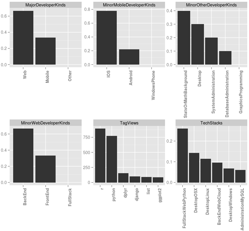
It got the StatsOrMathBackground right, and I can see how my Python and Django activity means I fit the profile of a web developer. I’m not sure why my MajorDeveloperKinds was 2/3 “Web” and 1/3 “Mobile” (when between those three options I certainly fit “Other”” the most), but it’s certainly food for thought.
Try it yourself! (And check out the R code here).