Previously in this series
In the last post, we examined an available genomic dataset from Brauer et al 2008 about yeast gene expression under nutrient starvation. We learned to tidy it with the dplyr and tidyr packages, and saw how useful this tidied form is for visualizing and understanding individual genes.
But we were just getting started with our tidy data analysis. We were able to look at a few genes at a time, but that approach doesn’t scale to a genome with 6,000 genes in it. In order to select interesting genes from the entire dataset (without guessing which genes we should look at in advance), we’ll need to do some kind of modeling.
Here I’ll show how to use dplyr to fit linear models to each gene-nutrient combination, while using my broom package to recombine these models so that we can keep working with the same tidy tools.
Setup
In the last post we showed how to tidy the Brauer gene expression dataset. To catch yourself up, you can run the following code:
library(readr)
library(dplyr)
library(tidyr)
library(ggplot2)

url <- "http://varianceexplained.org/files/Brauer2008_DataSet1.tds"

nutrient_names <- c(G = "Glucose", L = "Leucine", P = "Phosphate",
               S = "Sulfate", N = "Ammonia", U = "Uracil")

cleaned_data <- read_delim(url, delim = "\t") %>%
  separate(NAME, c("name", "BP", "MF", "systematic_name", "number"), sep = "\\|\\|") %>%
  mutate_each(funs(trimws), name:systematic_name) %>%
  select(-number, -GID, -YORF, -GWEIGHT) %>%
  gather(sample, expression, G0.05:U0.3) %>%
  separate(sample, c("nutrient", "rate"), sep = 1, convert = TRUE) %>%
  mutate(nutrient = plyr::revalue(nutrient, nutrient_names)) %>%
  filter(!is.na(expression), systematic_name != "")
(Please note that I’ve added two steps of cleaning we didn’t do in the last post. First, I spelled out the full names of the nutrients- “Glucose” instead of just “G”, for example. Second, I filtered out missing values from the expression column, as well as genes that have no systematic ID).
Tidying the data in this way lets us make graphs like this:
cleaned_data %>%
  filter(BP == "leucine biosynthesis") %>%
  ggplot(aes(rate, expression, color = nutrient)) +
  geom_point() +
  geom_smooth(method = "lm", se = FALSE) +
  facet_wrap(~name + systematic_name)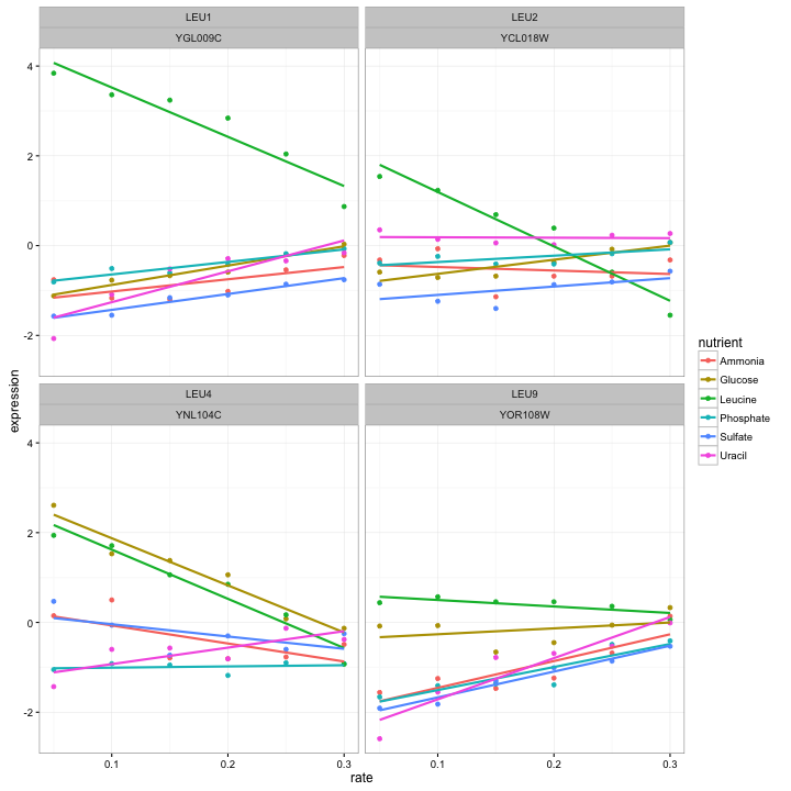
For starters, let’s wrap this useful graph into a function, so that we can make it easily in the rest of the post.
plot_expression_data <- function(expression_data) {
  ggplot(expression_data, aes(rate, expression, color = nutrient)) +
    geom_point() +
    geom_smooth(method = "lm", se = FALSE) +
    facet_wrap(~name + systematic_name, scales = "free_y")
}
At which point we would rewrite the above graph like:
cleaned_data %>%
  filter(BP == "leucine biosynthesis") %>%
  plot_expression_data()
This is a great way to visualize a few genes at a time. But there are so many genes in the dataset. For example, let’s instead filter by the biological process cell wall organization and biogenesis.
cleaned_data %>%
  filter(BP == "cell wall organization and biogenesis") %>%
  plot_expression_data()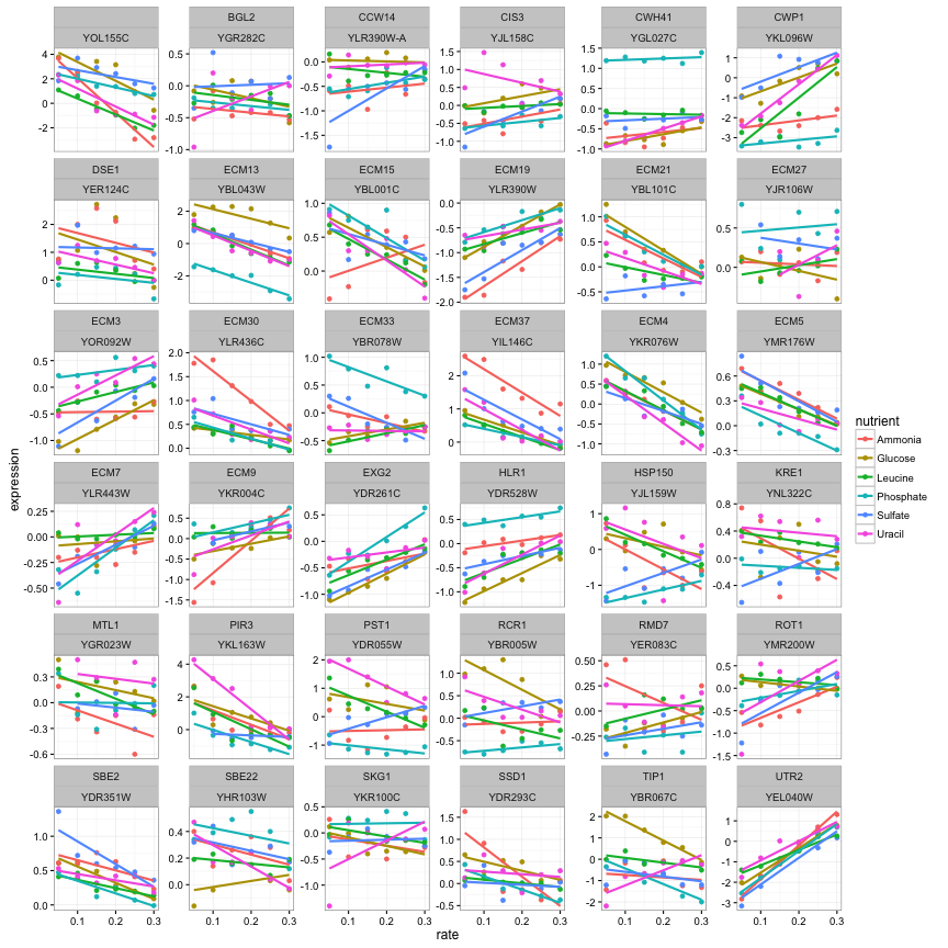
OK, that’s 36 genes and it’s already getting a lot harder to understand these plots. And we have 5500 genes in this dataset: no way can we visually interpret all those genes at once. This is where we introduce modeling.
Linear Regressions
Let’s look back at one of our notable genes: LEU1 under leucine starvation.
LEU1_leucine <- cleaned_data %>%
  filter(name == "LEU1", nutrient == "Leucine")

ggplot(LEU1_leucine, aes(rate, expression)) +
  geom_point()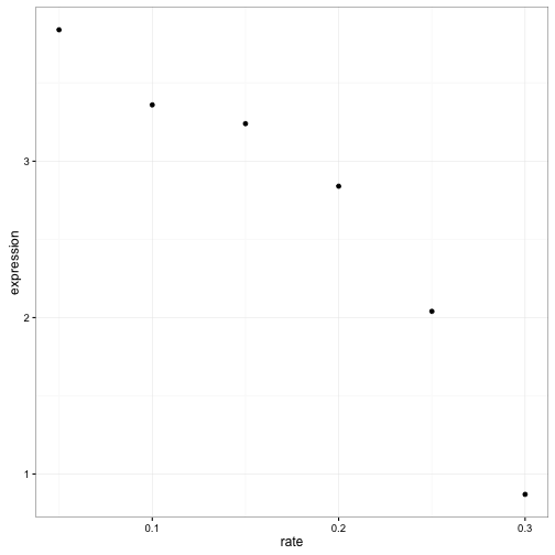
Visually it’s pretty clear that there’s a negative relationship between growth rate and expression. And statisticians have a pretty good idea how we to see if this trend is statistically significant: linear regression.
mod <- lm(expression ~ rate, LEU1_leucine)
summary(mod)
##
## Call:
## lm(formula = expression ~ rate, data = LEU1_leucine)
##
## Residuals:
## 1 2 3 4 5 6
## -0.2305 -0.1616 0.2672 0.4161 0.1650 -0.4562
##
## Coefficients:
## Estimate Std. Error t value Pr(>|t|)
## (Intercept) 4.6193 0.3481 13.272 0.000186 ***
## rate -10.9771 1.7874 -6.141 0.003564 **
## ---
## Signif. codes: 0 '***' 0.001 '**' 0.01 '*' 0.05 '.' 0.1 ' ' 1
##
## Residual standard error: 0.3739 on 4 degrees of freedom
## Multiple R-squared: 0.9041, Adjusted R-squared: 0.8801
## F-statistic: 37.72 on 1 and 4 DF, p-value: 0.003564OK, so it looks like this trend is significant (p-value 0.0035645).
We could do this one at a time for each gene/nutrient combination. But really we want to apply it to every combination of a gene and a nutrient.1 This is a problem, because that lm object isn’t designed for recombining. It contains many components of varying shapes: residuals, fitted values, an F-statistic, and so on. Having a list of those objects isn’t going to work with dplyr or with ggplot2: it would take us out of the tidy data framework.
This is where we bring in my broom package, which is designed for this very purpose: turning model objects into data frames. This lets us work with the outputs of models- graphing, sorting and summarizing them- using the same tidy tools we used to process our data.
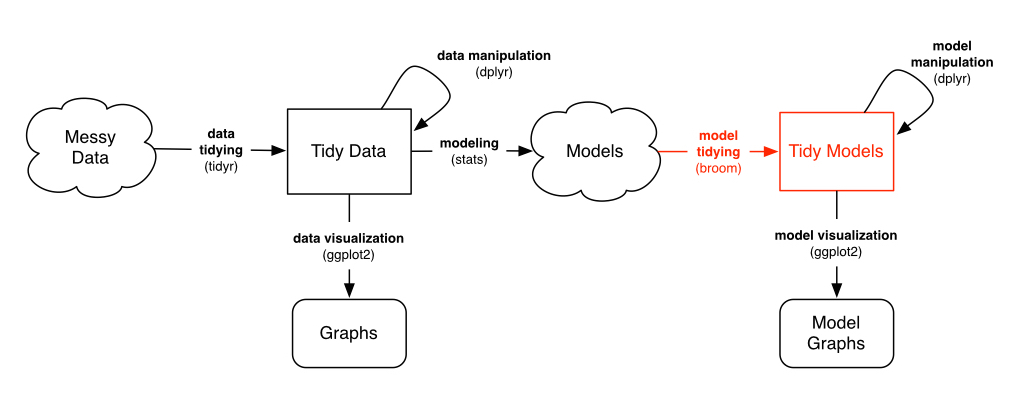
In particular, right now we want the tidy method, which extracts the coefficients of a model.
library(broom)
tidy(mod)
## term estimate std.error statistic p.value
## 1 (Intercept) 4.619333 0.3480526 13.271941 0.0001862742
## 2 rate -10.977143 1.7874331 -6.141289 0.0035644825Notice that it has the same information as coef(summary(mod)): slope estimate, standard error, t-statistic, and p-value for each coefficient. But now it’s in a data frame, rather than a matrix, and the rownames have been moved into a column of the data frame. This lets us combine multiple models, which in turn lets us perform the modeling within a do statement.
linear_models <- cleaned_data %>%
  group_by(name, systematic_name, nutrient) %>%
  do(tidy(lm(expression ~ rate, .)))
(Note that this step might take a minute or two to run). What does the resulting data frame look like?
linear_models## Source: local data frame [66,428 x 8]
## Groups: name, systematic_name, nutrient
##
## name systematic_name nutrient term estimate std.error
## 1 Q0017 Ammonia (Intercept) 0.3926667 0.29767373
## 2 Q0017 Ammonia rate -1.2914286 1.52871116
## 3 Q0017 Glucose (Intercept) -0.3533333 0.05948856
## 4 Q0017 Glucose rate 1.6000000 0.30550505
## 5 Q0017 Leucine (Intercept) 0.3873333 0.17284216
## 6 Q0017 Leucine rate -0.5657143 0.88763540
## 7 Q0017 Phosphate (Intercept) -0.4493333 0.17093339
## 8 Q0017 Phosphate rate 1.1200000 0.87783283
## 9 Q0017 Sulfate (Intercept) 1.9140000 0.62963920
## 10 Q0017 Sulfate rate -7.1942857 3.23352843
## .. ... ... ... ... ... ...
## Variables not shown: statistic (dbl), p.value (dbl)Notice that there are two rows for each gene-nutrient combination: an intercept and a slope term. (You can read more about using broom and dplyr together in this vignette). This is simplifying each gene-nutrient combination into two values:
- Intercept: How highly expressed the gene is when it’s starved of that nutrient.
- rate: How much the gene’s expression responds to an increasing supply of that nutrient (and therfore an increasing growth rate)
We’ll take a brief look at those one at a time.
Intercept terms
intercept_terms <- linear_models %>%
  ungroup() %>%
  filter(term == "(Intercept)")

intercept_terms
## Source: local data frame [33,215 x 8]
##
## name systematic_name nutrient term estimate std.error
## 1 Q0017 Ammonia (Intercept) 0.3926667 0.29767373
## 2 Q0017 Glucose (Intercept) -0.3533333 0.05948856
## 3 Q0017 Leucine (Intercept) 0.3873333 0.17284216
## 4 Q0017 Phosphate (Intercept) -0.4493333 0.17093339
## 5 Q0017 Sulfate (Intercept) 1.9140000 0.62963920
## 6 Q0017 Uracil (Intercept) 1.1846667 0.61898114
## 7 Q0182 Ammonia (Intercept) -2.2780000 0.50822867
## 8 Q0182 Glucose (Intercept) -0.9933333 0.30057933
## 9 Q0182 Leucine (Intercept) -1.3186667 0.47330503
## 10 Q0182 Phosphate (Intercept) -1.3853333 0.16465413
## .. ... ... ... ... ... ...
## Variables not shown: statistic (dbl), p.value (dbl)The p-values aren’t actually interesting to us here: they’re testing whether the intercept is equal to 0, which is not a particularly special number in terms of these normalized gene expressions. (Confidence intervals and standard errors would be, which I may discuss in a future post).
What we’re really interested in is the value of each intercept relative to the other nutrients in that gene. For example, let’s again consider our favorite gene, LEU1.
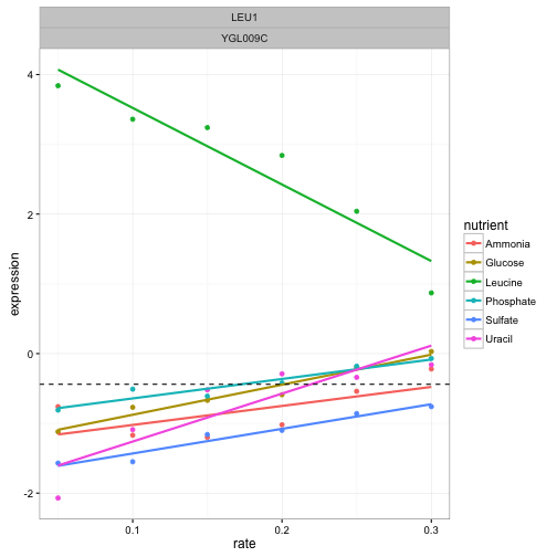
This gene has a low intercept term for all nutrients except leucine. I’ve marked the average intercept with a horizontal dashed line to demonstrate this. Suppose we want to look for other genes like this, with a single outlying intercept term. We could do this by centering the intercepts around the average for each gene, using a group_by and mutate:
centered_intercepts <- intercept_terms %>%
  group_by(systematic_name) %>%
  mutate(centered_intercept = estimate - mean(estimate)) %>%
  ungroup()
Now we are interested in the most extreme cases, where the intercept is very far from the other nutrients. The top_n function is useful for this.
top_intercept <- centered_intercepts %>%
  top_n(20, centered_intercept)
Note that here I’m looking for cases where a single nutrient was greatly overexpressed in starvation (to look for underexpressed nutrients, we could have used -centered_intercept instead). We can then pull these genes out of the original data with the useful semi_join, at which point we can graph it with our plot_expression_data:
cleaned_data %>%
  semi_join(top_intercept, by = "systematic_name") %>%
  plot_expression_data()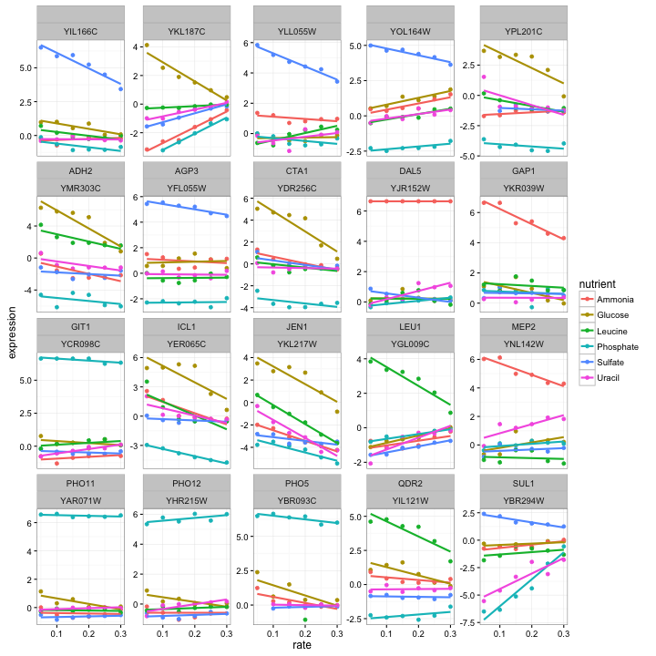
These certainly do look like interesting genes! We notice that some genes, like PHO11, only one nutrient is highly expressed while the rest show low expression, while other genes, such as ADH2, show varying levels of expression for each nutrient. We also notice that in most cases the highly expressed nutrient is moving back down towards the others as growth rate increases (that is, as the yeast is less starved). This makes sense, since it’s the starvation that is eliciting the unusual behavior.
What do these genes do? Beats me; I’m not a biologist, I just play one on my degree. But it certainly looks promising that PHO11, PHO12. and PHO5 are both much higher expressed when phosphorus is the limiting nutrient, as well as SUL1 when sulfur is rare- and indeed each gene is involved in transport of that nutrient. (And we do see our Gene of the Week, LEU1).
Looking up the others in yeastgenome.org, we see that a lot of them are involved in transport across membranes (e.g. DAL5, GAP1, QDR2). This makes sense: the cell notices that it is missing a nutrient, and puts more energy into importing it. Notice that this would be a great way to make inferences about genes whose function we don’t yet know. (This is the focus of functional genomics).
Slope terms
Now let’s take a look at the slope terms, which shows whether each gene increased or decreased its growth rate in a particular condition.
slope_terms <- linear_models %>%
  ungroup() %>%
  filter(term == "rate", !is.na(p.value))
Here, we’ll focus a bit more on statistical significance. First we can make a histogram of the p-values. These p-values are spread across six different nutrients, so we’ll facet our histogram by those nutrients:
ggplot(slope_terms, aes(p.value)) +
  geom_histogram(binwidth = .05) +
  facet_wrap(~nutrient)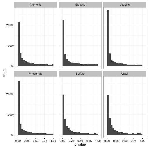
See here for my guide on interpreting this kind of p-value histogram. In this case, we can see that the tests are generally well-behaved, with a mix of nulls (genes that don’t respond to growth rate) and alternatives (genes that do). Thus, we can use p-value correction to identify significant genes. Since we have a lot of hypotheses, it’s a good idea to use the Storey q-value.2
# see https://bioconductor.org/packages/release/bioc/html/qvalue.html
# for installation instructions
library(qvalue)
slope_terms <- slope_terms %>%
  mutate(q.value = qvalue(p.value)$qvalues)
(I talk a bit about FDR and q-value from a Bayesian perspective here).
Now that we have a measure of signiifcance, we can ask all sorts of questions. We could ask which nutrients have the most genes significantly correlated with expression (at a 1% FDR):
slope_terms %>%
  group_by(nutrient) %>%
  summarize(significant = sum(q.value < .01)) %>%
  arrange(-significant)
## Source: local data frame [6 x 2]
##
## nutrient significant
## 1 Phosphate 909
## 2 Leucine 753
## 3 Glucose 706
## 4 Ammonia 573
## 5 Sulfate 264
## 6 Uracil 239Here’s an interesting question: are there any cases where the gene is significantly positively correlated with growth rate in one limiting nutrient, and significantly negatively correlated in another? We can discover this with a group_by and filter:
diff_direction_genes <- slope_terms %>%
    filter(q.value < .01) %>%
    group_by(systematic_name) %>%
    filter(any(estimate > 0) & any(estimate < 0))
It turns out there are only 17 genes that fit this condition, which we can plot:
cleaned_data %>%
    semi_join(diff_direction_genes, by = "systematic_name") %>%
    plot_expression_data()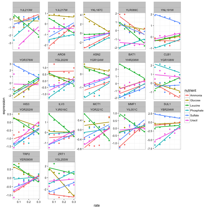
Those certainly look like genes worthy of further study. But you may be interested in different phenomena when you’re analyzing your data- you might want cases where expression responds to glucose, but no other conditions. This tidy setup of the models makes it easy to answer these questions in an interactive and exploratory way.
Conclusion: Surprise, surprise
These linear regressions are a great way to pull out the most interesting genes. Why didn’t we start with that step? Why bother visualizing individual genes at all?
Well, as Hadley Wickham has noted (by way of John D. Cook):
Visualization can surprise you, but it doesn’t scale well.
Modeling scales well, but it can’t surprise you.
When we chose to model gene expression with linear regression, we made a strong assumption: that we could represent each gene’s trend using a linear regression within each gene/nutrient combination. We couldn’t do that if we’d noticed some genes had a non-linear trend- something like this:
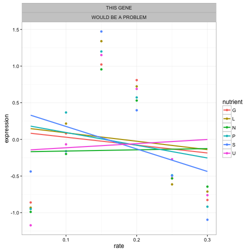
That’s why I always recommend looking at small subsets first, like a single gene or biological process.
If your data's huge, analyze a small subset first to check approach. Like navigating the route on a bike before trying your 18-wheeler truck
— David Robinson (@drob) September 4, 2015If we’d seen any genes that had this kind of expression profile, we’d have known to choose a different approach. It’s still possible there are weird genes like this! If they are, our regressions would not find them, because our model will never surprise us. There’s no free lunch!
Next time
Earlier in this post I showed the expression of four genes involved in “leucine biosynthesis”. Now that we have our per-gene-per-nutrient linear model, here’s another way we can look at them:
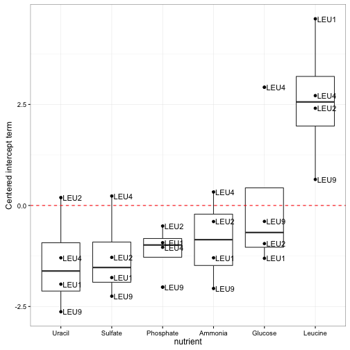
Notice how clear it is that these genes respond to leucine starvation in particular. Unlike the earlier visualization, this can be applied to gene sets containing dozens or even hundreds of genes while still making the general trend apparent. Furthermore, we could use these summaries to look at many gene sets at once, and even use statistical tests to discover new gene sets that respond to starvation.
Thus, in my next post in this series, we’ll apply our “tidy modeling” approach to a new problem. Instead of testing whether each gene responds to starvation in an interesting way, we’ll test functional groups of genes in order to find higher-level biological insights. And we’ll do it with these same set of tidy tools we’ve been using so far.
Footnotes
-
Most statisticians will note that we could have performed one-model-per-gene, and included an interaction term. I chose to perform one-model-per-gene-per-nutrient only because it’s simpler: we don’t have to explain the concept of interaction terms or parse apart that column, and we get the same results. ↩
-
If we had used Bonferroni correction with more than 30,000 genes, basically none of them would have ended up significant. Even Benjamini-Hochberg FDR control may not be powerful enough. But the Storey q-value is well suited to control false discovery rate when we expect that a substantial portion of our hypotheses are not null (say, 20%, rather than .02%). Based on our p-value histograms, this appears to be the case. ↩
