
I recently came up with the idea for a series of screencasts:
I've thought about recording a screencast of an example data analysis in #rstats. I'd do it on a dataset I'm unfamiliar with so that I can show and narrate my live thought process.
— David Robinson (@drob) October 6, 2018
Any suggestions for interesting datasets to use?
Hadley Wickham had the great suggestion of analyzing a Tidy Tuesday dataset. Tidy Tuesday is a fantastic project run by the R for Data Science online learning community (especially Thomas Mock) that releases an interesting dataset each week.
I’ve now released my first such screencast, exploring this week’s Tidy Tuesday dataset on (the data behind The Economic Guide to Picking a College Major). You can also find the R Markdown I produced here.
I produced a handful of figures that I found pretty interesting. I took a look at the distribution of income from graduates within each category of major.

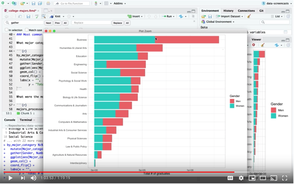
I spent some time on looking at the differences in gender distribution across majors, which was also included in the data.
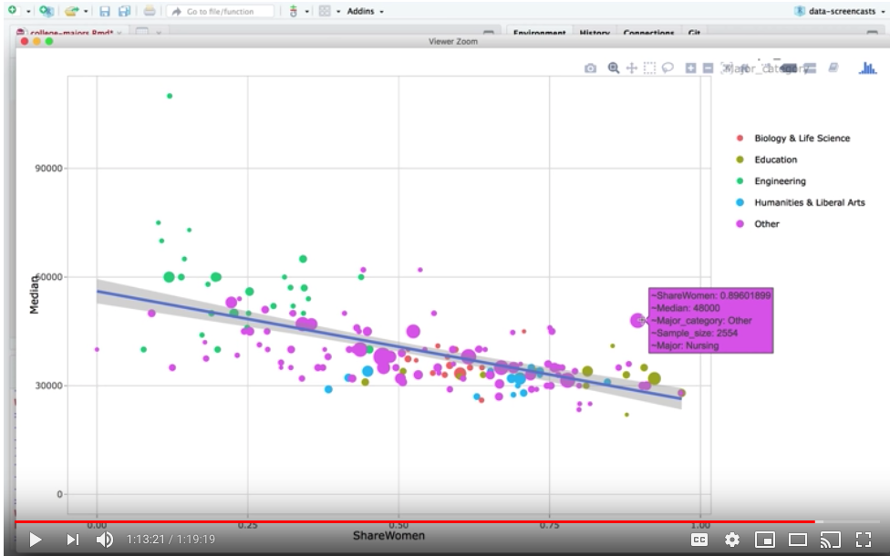
And I ended by setting up an interactive scatterplot with the plotly package that compared the share of women in a field to the median salary.
Some notes and observations:
- This isn’t an R tutorial: If I were teaching R, I’d have prepared in advance and moved more slowly through the material. This is a case study in how I’d dive into a dataset and learn from it, including steps where I think aloud and decide what route to take. If anything, it’s closer to a “speedrun”.
- I enjoyed showing the order I work in: I write blog posts somewhat “inside-out”: I start with a few figures, then figure out what preprocessing I should have started with, and I’m always moving uninteresting figures out of the post or to appendices. It was nice to show how an analysis took shape and ended up looking like a organized final product.
- I ran into fewer bugs than I expected to Part of the excitement of a live screencast is that “anything can go wrong” (part of the reason I recorded this first one in advance rather than live is to practice with less pressure!) I was pretty well versed in the tools I used in this session (dplyr and ggplot2), so I got stuck on only a handful of bugs (though I did go down a few unproductive routes).
I had enough fun that I think I’ll do it again (though probably not every week). With that in mind, I’ve learned some lessons that might improve my future screencasts:
- I speak too fast: this is a recurring issue for me. When I’m speaking in front of an audience I can watch people’s faces and pace myself a bit better, but when I’m “by myself” while recording it’s difficult. I’ve learned this is especially difficult for non-native listeners, and I’ll try to be more conscious and speak slower!
- I need to keep a better eye on time: The screencast is about 80 minutes long (I’d originally planned on an hour, and I’ll probably aim for that in the future). I’d be interested in feedback about the length, and whether people find the whole session interesting.
I look forward to hearing your feedback, and to recording to the next one!