
Previously in this series:
- The beta distribution
- Empirical Bayes estimation
- Credible intervals
- The Bayesian approach to false discovery rates
- Bayesian A/B testing
- Beta-binomial regression
- Understanding empirical Bayesian hierarchical modeling
- Mixture models and expectation-maximization
We’ve introduced a number of statistical techniques in this series: estimating a beta prior, beta-binomial regression, hypothesis testing, mixture models, and many other components of the empirical Bayes approach. These approaches are useful whenever you have many observations of success/total data.
Since I’ve provided the R code within each post, you can certainly apply these methods to your own data (as some already have!). However, you’d probably find yourself copying and pasting a rather large amount of code, which can take you out of the flow of your own data analysis and introduces opportunities for mistakes.
Here, I’ll introduce the new ebbr package for performing empirical Bayes on binomial data. The package offers convenient tools for performing almost all the analyses we’ve done during this series, along with documentation and examples. This post also serves as review of our entire empirical Bayes series so far: we’ll touch on each post briefly and recreate some of the key results.
Setup
We start, as always, by assembling some per-player batting data (note that all the code in this post can be found here). It’s worth remembering that while we’re using batting averages as an example, this package can be applied to many types of data.
library(Lahman)
library(dplyr)
library(tidyr)

# Grab career batting average of non-pitchers
# (allow players that have pitched <= 3 games, like Ty Cobb)
pitchers <- Pitching %>%
  group_by(playerID) %>%
  summarize(gamesPitched = sum(G)) %>%
  filter(gamesPitched > 3)

# Add player names
player_names <- Master %>%
  tbl_df() %>%
  dplyr::select(playerID, nameFirst, nameLast, bats) %>%
  unite(name, nameFirst, nameLast, sep = " ")

# include the "bats" (handedness) and "year" column for later
career_full <- Batting %>%
  filter(AB > 0) %>%
  anti_join(pitchers, by = "playerID") %>%
  group_by(playerID) %>%
  summarize(H = sum(H), AB = sum(AB), year = mean(yearID)) %>%
  inner_join(player_names, by = "playerID") %>%
  filter(!is.na(bats))

# We don't need all this data for every step
career <- career_full %>%
  select(-bats, -year)
Empirical Bayes estimation
In one of the first posts in the series, we noticed that the distribution of player batting averages looked roughly like a beta distribution:
career %>%
  filter(AB >= 100) %>%
  ggplot(aes(H / AB)) +
  geom_histogram()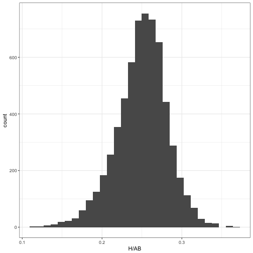
We thus wanted to estimate the beta prior for the overall dataset, which is the first step of empirical Bayes analysis. The ebb_fit_prior function encapsulates this, taking the data along with the success/total columns and fitting the beta through maximum likelihood.
library(ebbr)

prior <- career %>%
  filter(AB >= 500) %>%
  ebb_fit_prior(H, AB)

prior
## Empirical Bayes binomial fit with method mle
## Parameters:
## # A tibble: 1 × 2
## alpha beta
## <dbl> <dbl>
## 1 96.9 275prior is an ebb_prior object, which is a statistical model object containing the details of the beta distribution. Here we can see the overall alpha and beta parameters. (We’ll see later that it can store more complicated models).
The second step of empirical Bayes analysis is updating each observation based on the overall statistical model. Based on the philosophy of the broom package, this is achieved with the augment function:
augment(prior, data = career)## # A tibble: 9,548 × 10
## playerID H AB name .alpha1 .beta1 .fitted .raw
## <chr> <int> <int> <chr> <dbl> <dbl> <dbl> <dbl>
## 1 aaronha01 3771 12364 Hank Aaron 3867.9 8868 0.304 0.3050
## 2 aaronto01 216 944 Tommie Aaron 312.9 1003 0.238 0.2288
## 3 abadan01 2 21 Andy Abad 98.9 294 0.252 0.0952
## 4 abadijo01 11 49 John Abadie 107.9 313 0.257 0.2245
## 5 abbated01 772 3044 Ed Abbaticchio 868.9 2547 0.254 0.2536
## 6 abbeych01 492 1751 Charlie Abbey 588.9 1534 0.277 0.2810
## 7 abbotda01 1 7 Dan Abbott 97.9 281 0.259 0.1429
## 8 abbotfr01 107 513 Fred Abbott 203.9 681 0.231 0.2086
## 9 abbotje01 157 596 Jeff Abbott 253.9 714 0.262 0.2634
## 10 abbotku01 523 2044 Kurt Abbott 619.9 1796 0.257 0.2559
## # ... with 9,538 more rows, and 2 more variables: .low <dbl>, .high <dbl>Notice we’ve now added several columns to the original data, each beginning with . (which is a convention of the augment verb to avoid rewriting e. We have the .alpha1 and .beta1 columns as the parameters for each player’s posterior distribution, as well as .fitted representing the new posterior mean (the “shrunken average”).
We often want to run these two steps in sequence: estimating a model, then using it as a prior for each observation. The ebbr package provides a shortcut, combining them into one step with add_ebb_estimate:
eb_career <- career %>%
  add_ebb_estimate(H, AB, prior_subset = AB >= 500)

eb_career
## # A tibble: 9,548 × 10
## playerID H AB name .alpha1 .beta1 .fitted .raw
## <chr> <int> <int> <chr> <dbl> <dbl> <dbl> <dbl>
## 1 aaronha01 3771 12364 Hank Aaron 3867.9 8868 0.304 0.3050
## 2 aaronto01 216 944 Tommie Aaron 312.9 1003 0.238 0.2288
## 3 abadan01 2 21 Andy Abad 98.9 294 0.252 0.0952
## 4 abadijo01 11 49 John Abadie 107.9 313 0.257 0.2245
## 5 abbated01 772 3044 Ed Abbaticchio 868.9 2547 0.254 0.2536
## 6 abbeych01 492 1751 Charlie Abbey 588.9 1534 0.277 0.2810
## 7 abbotda01 1 7 Dan Abbott 97.9 281 0.259 0.1429
## 8 abbotfr01 107 513 Fred Abbott 203.9 681 0.231 0.2086
## 9 abbotje01 157 596 Jeff Abbott 253.9 714 0.262 0.2634
## 10 abbotku01 523 2044 Kurt Abbott 619.9 1796 0.257 0.2559
## # ... with 9,538 more rows, and 2 more variables: .low <dbl>, .high <dbl>(The add_ prefix is inspired by modelr’s add_residuals and add_predictions, which also fit a statistical model then append columns). Note the prior_subset argument, which noted that while we wanted to keep all the shrunken values in our output, we wanted to fit the prior only on individuals with at least 500 at-bats.
Estimates and credible intervals
Having the posterior estimates for each player lets us explore the model results using our normal tidy tools like dplyr and ggplot2. For example, we could visualize how batting averages were shrunken towards the mean of the prior:
eb_career %>%
  ggplot(aes(.raw, .fitted, color = AB)) +
  geom_point() +
  geom_abline(color = "red") +
  scale_color_continuous(trans = "log", breaks = c(1, 10, 100, 1000)) +
  geom_hline(yintercept = tidy(prior)$mean, color = "red", lty = 2) +
  labs(x = "Raw batting average",
       y = "Shrunken batting average")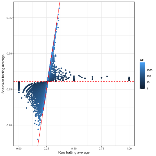
This was one of our first visualizations in the empirical Bayes estimation post. I like how it captures what empirical Bayes estimation is doing: moving all batting averages towards the prior mean (the dashed red line), but moving them less if there is a lot of information about that player (high AB).
In the following post, we used credible intervals, to visualize our uncertainty about each player’s true batting average. The output of add_ebb_estimate comes with those credible intervals in the form of .low and .high. This makes it easy to visualize these intervals for particular players, such as the 1998 Yankees:
yankee_1998 <- c("brosisc01", "jeterde01", "knoblch01",
                 "martiti02", "posadjo01", "strawda01", "willibe02")

eb_career %>%
  filter(playerID %in% yankee_1998) %>%
  mutate(name = reorder(name, .fitted)) %>%
  ggplot(aes(.fitted, name)) +
  geom_point() +
  geom_errorbarh(aes(xmin = .low, xmax = .high)) +
  labs(x = "Estimated batting average (w/ 95% confidence interval)",
       y = "Player")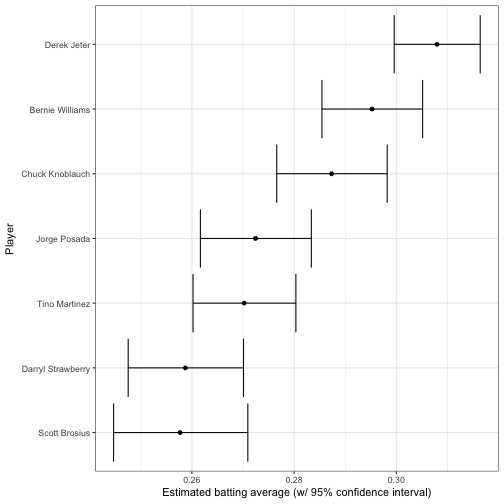
Notice that once we have the output from add_ebb_estimate, we’re no longer relying on the ebbr package, only on dplyr and ggplot2.
Hierarchical modeling
In two subsequent posts, we examined how this beta-binomial model may not be appropriate, because of the relationship between a player’s at-bats and their batting average. Good batters tend to have long careers, while poor batters may retire quickly.
career %>%
  filter(AB >= 10) %>%
  ggplot(aes(AB, H / AB)) +
  geom_point() +
  geom_smooth(method = "lm") +
  scale_x_log10()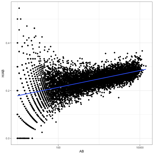
We solved this by fitting a prior that depended on AB, through beta-binomial regression. The add_ebb_estimate function offers this option, by setting method = "gamlss" and providing a formula to mu_predictors.
eb_career_ab <- career %>%
  add_ebb_estimate(H, AB, method = "gamlss",
                    mu_predictors = ~ log10(AB))

eb_career_ab
## # A tibble: 9,548 × 14
## playerID H AB name .mu .sigma .alpha0 .beta0
## <chr> <int> <int> <chr> <dbl> <dbl> <dbl> <dbl>
## 1 aaronha01 3771 12364 Hank Aaron 0.289 0.00181 159.6 393
## 2 aaronto01 216 944 Tommie Aaron 0.247 0.00181 136.5 416
## 3 abadan01 2 21 Andy Abad 0.193 0.00181 106.7 446
## 4 abadijo01 11 49 John Abadie 0.204 0.00181 112.9 440
## 5 abbated01 772 3044 Ed Abbaticchio 0.265 0.00181 146.7 406
## 6 abbeych01 492 1751 Charlie Abbey 0.257 0.00181 141.8 411
## 7 abbotda01 1 7 Dan Abbott 0.179 0.00181 99.1 454
## 8 abbotfr01 107 513 Fred Abbott 0.238 0.00181 131.4 421
## 9 abbotje01 157 596 Jeff Abbott 0.240 0.00181 132.6 420
## 10 abbotku01 523 2044 Kurt Abbott 0.259 0.00181 143.2 410
## # ... with 9,538 more rows, and 6 more variables: .alpha1 <dbl>,
## # .beta1 <dbl>, .fitted <dbl>, .raw <dbl>, .low <dbl>, .high <dbl>(You can also provide sigma_predictors to have the variance of the beta depend on regressors, though it’s less common that you’d want to do so).
The augmented output is now a bit more complicated: besides the posterior parameters such as .alpha1, .beta1, and .fitted, each observation also has its own prior parameters .alpha0 and .beta0. These are predicted based on the regression on AB.
The other parameters, such as .fitted and the credible interval, are now shrinking towards a trend rather than towards a constant. We can see this by plotting AB against the original and the shrunken estimates:
eb_career_ab %>%
  filter(AB > 10) %>%
  rename(Raw = .raw, Shrunken = .fitted) %>%
  gather(type, estimate, Raw, Shrunken) %>%
  ggplot(aes(AB, estimate)) +
  geom_point() +
  facet_wrap(~ type) +
  scale_x_log10()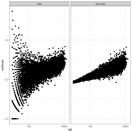
As we saw in the post on hierarchical modeling, the model can incorporate still more useful information. For example, it could include what year they play in, and whether they are left- or right- handed, both of which tend to affect batting average.
library(splines)

eb_career_prior <- career_full %>%
  ebb_fit_prior(H, AB, method = "gamlss",
                mu_predictors = ~ 0 + ns(year, df = 5) * bats + log(AB))
In this case I’m fitting the prior with ebb_fit_prior rather than adding the estimates with add_ebb_estimate. This lets us feed it new data that we generate ourselves, and examine how the posterior distribution would change. This takes a bit more work, but lets us re-generate one of the more interesting plots from that post about how time and handedness relate:
# fake data ranging from 1885 to 2013
fake_data <- crossing(H = 300,
                      AB = 1000,
                      year = seq(1885, 2013),
                      bats = c("L", "R"))

# find the mean of the prior, as well as the 95% quantiles,
# for each of these combinations. This does require a bit of
# manual manipulation of alpha0 and beta0:
augment(eb_career_prior, newdata = fake_data) %>%
  mutate(prior = .alpha0 / (.alpha0 + .beta0),
         prior.low = qbeta(.025, .alpha0, .beta0),
         prior.high = qbeta(.975, .alpha0, .beta0)) %>%
  ggplot(aes(year, prior, color = bats)) +
  geom_line() +
  geom_ribbon(aes(ymin = prior.low, ymax = prior.high), alpha = .1, lty = 2) +
  ylab("Prior distribution (mean + 95% quantiles)")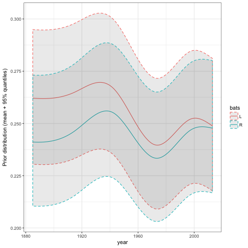
Since the ebbr package makes these models convenient to fit, you can try a few variations on the model and compare them.
Hypothesis testing
Another pair of posts examined the problem of hypothesis testing. For example, we wanted to get a posterior probability for the statement “this player’s true batting average is greater than .300”, so that we could construct a “Hall of Fame” of such players.
This method is implemented in the add_ebb_prop_test (notice that like add_ebb_estimate, it adds columns to existing data). add_ebb_prop_test takes the output of an earlier add_ebb_estimate operation, which contains posterior parameters for each observation, and appends columns to it:
test_300 <- career %>%
  add_ebb_estimate(H, AB, method = "gamlss", mu_predictors = ~ log10(AB)) %>%
  add_ebb_prop_test(.300, sort = TRUE)

test_300
## # A tibble: 9,548 × 16
## playerID H AB name .mu .sigma .alpha0 .beta0
## <chr> <int> <int> <chr> <dbl> <dbl> <dbl> <dbl>
## 1 cobbty01 4189 11434 Ty Cobb 0.287 0.00181 159 394
## 2 hornsro01 2930 8173 Rogers Hornsby 0.282 0.00181 156 397
## 3 speaktr01 3514 10195 Tris Speaker 0.285 0.00181 158 395
## 4 delahed01 2596 7505 Ed Delahanty 0.280 0.00181 155 398
## 5 willite01 2654 7706 Ted Williams 0.281 0.00181 155 398
## 6 keelewi01 2932 8591 Willie Keeler 0.283 0.00181 156 397
## 7 lajoina01 3242 9589 Nap Lajoie 0.284 0.00181 157 396
## 8 jacksjo01 1772 4981 Shoeless Joe Jackson 0.274 0.00181 151 402
## 9 gwynnto01 3141 9288 Tony Gwynn 0.284 0.00181 157 396
## 10 heilmha01 2660 7787 Harry Heilmann 0.281 0.00181 155 397
## # ... with 9,538 more rows, and 8 more variables: .alpha1 <dbl>,
## # .beta1 <dbl>, .fitted <dbl>, .raw <dbl>, .low <dbl>, .high <dbl>,
## # .pep <dbl>, .qvalue <dbl>(Note the sort = TRUE argument, which sorts in order of our confidence in each player). There are now too many columns to read easily, so we’ll select only a few of the most interesting ones:
test_300 %>%
  select(name, H, AB, .fitted, .low, .high, .pep, .qvalue)
## # A tibble: 9,548 × 8
## name H AB .fitted .low .high .pep .qvalue
## <chr> <int> <int> <dbl> <dbl> <dbl> <dbl> <dbl>
## 1 Ty Cobb 4189 11434 0.363 0.354 0.371 2.41e-49 2.41e-49
## 2 Rogers Hornsby 2930 8173 0.354 0.344 0.364 2.57e-27 1.28e-27
## 3 Tris Speaker 3514 10195 0.342 0.333 0.351 6.91e-21 2.30e-21
## 4 Ed Delahanty 2596 7505 0.341 0.331 0.352 5.77e-16 1.44e-16
## 5 Ted Williams 2654 7706 0.340 0.330 0.350 1.84e-15 4.84e-16
## 6 Willie Keeler 2932 8591 0.338 0.328 0.347 3.50e-15 9.86e-16
## 7 Nap Lajoie 3242 9589 0.335 0.326 0.344 1.04e-14 2.32e-15
## 8 Shoeless Joe Jackson 1772 4981 0.348 0.335 0.360 1.40e-14 3.78e-15
## 9 Tony Gwynn 3141 9288 0.335 0.326 0.344 2.68e-14 6.34e-15
## 10 Harry Heilmann 2660 7787 0.338 0.327 0.348 6.70e-14 1.24e-14
## # ... with 9,538 more rowsNotice that two columns have been added, with per-player metrics described in this post.
.pep: the posterior error probability- the probability that this player’s true batting average is less than .3..qvalue: the q-value, which corrects for multiple testing by controlling for false discovery rate (FDR). Allowing players with a q-value below .05 would mean only 5% of the ones included would be false discoveries.
For example, we could find how many players would be added to our “Hall of Fame” with an FDR of 5%, or 1%:
sum(test_300$.qvalue < .05)## [1] 115sum(test_300$.qvalue < .01)## [1] 79Player-player A/B test
Another post discussed the case where instead of comparing each observation to a single threshold (like .300) we want to compare to another player’s posterior distribution. I noted that this is similar to the problem of “A/B testing”, where we might be comparing two clickthrough rates, each represented by successes / total.
The post compared each player in history to Mike Piazza, and found players we were confident were better batters. We’d first find Piazza’s posterior parameters:
piazza <- eb_career_ab %>%
  filter(name == "Mike Piazza")

piazza_params <- c(piazza$.alpha1, piazza$.beta1)
piazza_params
## [1] 2281 5183This vector of two parameters, an alpha and a beta, can be passed into add_ebb_prop_test just like we passed in a threshold:1
compare_piazza <- eb_career_ab %>%
  add_ebb_prop_test(piazza_params, approx = TRUE, sort = TRUE)
Again we select only a few interesting columns:
compare_piazza %>%
  select(name, H, AB, .fitted, .low, .high, .pep, .qvalue)
## # A tibble: 9,548 × 8
## name H AB .fitted .low .high .pep .qvalue
## <chr> <int> <int> <dbl> <dbl> <dbl> <dbl> <dbl>
## 1 Ty Cobb 4189 11434 0.363 0.354 0.371 7.00e-17 7.00e-17
## 2 Rogers Hornsby 2930 8173 0.354 0.344 0.364 4.16e-11 2.08e-11
## 3 Tris Speaker 3514 10195 0.342 0.333 0.351 1.49e-07 4.98e-08
## 4 Shoeless Joe Jackson 1772 4981 0.348 0.335 0.360 2.45e-07 9.87e-08
## 5 Ed Delahanty 2596 7505 0.341 0.331 0.352 9.41e-07 2.67e-07
## 6 Ted Williams 2654 7706 0.340 0.330 0.350 1.84e-06 5.30e-07
## 7 Willie Keeler 2932 8591 0.338 0.328 0.347 5.06e-06 1.18e-06
## 8 Harry Heilmann 2660 7787 0.338 0.327 0.348 8.64e-06 2.11e-06
## 9 Billy Hamilton 2158 6268 0.339 0.328 0.350 1.09e-05 3.09e-06
## 10 Nap Lajoie 3242 9589 0.335 0.326 0.344 1.59e-05 4.37e-06
## # ... with 9,538 more rowsJust like the one-sample test, we’ve added .pep and .qvalue columns. From this we can see a few players who we’re extremely confident are better than Piazza.
Mixture models
This brings us to my recent post on mixture models, where we noticed that when pitchers are included, the data looks a lot less like a beta distribution and more like a combination of two betas.
career_w_pitchers <- Batting %>%
  filter(AB >= 25, lgID == "NL", yearID >= 1980) %>%
  group_by(playerID) %>%
  summarize(H = sum(H), AB = sum(AB), year = mean(yearID)) %>%
  mutate(isPitcher = playerID %in% pitchers$playerID) %>%
inner_join(player_names, by = "playerID")ggplot(career_w_pitchers, aes(H / AB)) +
geom_histogram()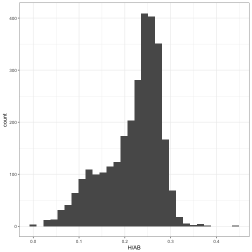
Fitting a mixture model, to separate out the two beta distributions so they could be shrunken separately, took a solid amount of code.
The ebbr package thus provides tools for fitting a mixture model using an iterative expectation-maximization algorithm, with the ebb_fit_mixture function. Like the other estimation functions, it takes a table as the first argument, followed by two arguments for the “successes” column and the “total” column:
set.seed(2017)
mm <- ebb_fit_mixture(career_w_pitchers, H, AB, clusters = 2)
It returns the parameters of two (or more) beta distributions:
tidy(mm)## # A tibble: 2 × 6
## cluster alpha beta mean number probability
## <chr> <dbl> <dbl> <dbl> <int> <dbl>
## 1 2 159.2 455 0.259 1981 0.5
## 2 1 26.7 158 0.144 910 0.5It also assigns each observation to the most likely cluster. Here, we can see that cluster 1 is made up of pitchers, while cluster 2 is the non-pitchers:
ggplot(mm$assignments, aes(H / AB, fill = .cluster)) +
  geom_histogram(alpha = 0.8, position = "identity")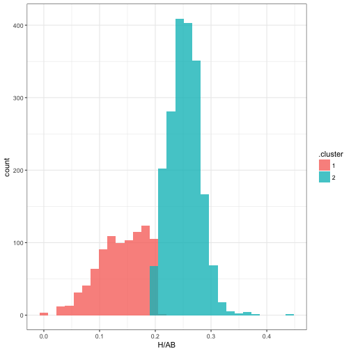
Mixture model across iterations
You may be interested in how the mixture model converged to its parameters. The iterations component of the ebb_mixture object contains details on the iterations, which can be visualized.
fits <- mm$iterations$fits

fits
## # A tibble: 6 × 7
## iteration cluster alpha beta mean number probability
## <int> <chr> <dbl> <dbl> <dbl> <int> <dbl>
## 1 1 2 16.2 55.1 0.228 1456 0.5
## 2 1 1 15.7 53.6 0.226 1435 0.5
## 3 2 2 156.3 446.5 0.259 1956 0.5
## 4 2 1 28.7 169.2 0.145 935 0.5
## 5 3 2 159.2 454.6 0.259 1981 0.5
## 6 3 1 26.7 158.0 0.144 910 0.5fits %>%
gather(parameter, value, alpha, beta, mean) %>%
ggplot(aes(iteration, value, color = parameter, lty = cluster)) +
geom_line() +
facet_wrap(~ parameter, scales = "free_y")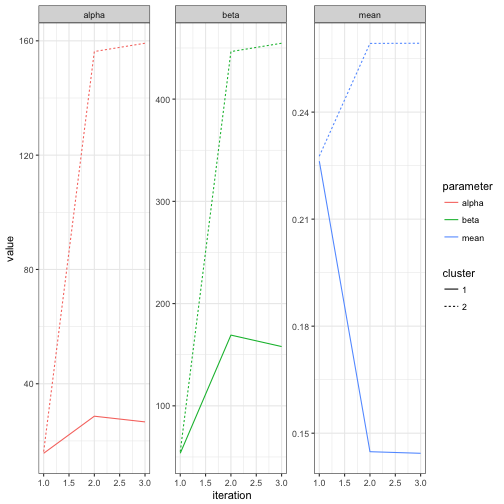
Note that it took only about one full iteration for the parameters to get pretty close to their eventual values. We can also examine the change in cluster assignments for each observation:
assignments <- mm$iterations$assignments

assignments
## # A tibble: 11,564 × 10
## iteration playerID H AB year isPitcher name
## <int> <chr> <int> <int> <dbl> <lgl> <chr>
## 1 1 abbotje01 11 42 2001 FALSE Jeff Abbott
## 2 1 abbotku01 473 1851 1997 FALSE Kurt Abbott
## 3 1 abbotky01 2 29 1992 TRUE Kyle Abbott
## 4 1 abercre01 86 386 2007 FALSE Reggie Abercrombie
## 5 1 abnersh01 110 531 1989 FALSE Shawn Abner
## 6 1 abreubo01 1602 5373 2003 FALSE Bobby Abreu
## 7 1 abreuto01 127 497 2010 FALSE Tony Abreu
## 8 1 acevejo01 6 77 2002 TRUE Jose Acevedo
## 9 1 ackerji01 3 28 1986 TRUE Jim Acker
## 10 1 adamsma01 257 909 2013 FALSE Matt Adams
## # ... with 11,554 more rows, and 3 more variables: bats <fctr>,
## # .cluster <chr>, .likelihood <dbl>assignments %>%
ggplot(aes(H / AB, fill = .cluster)) +
geom_histogram(alpha = 0.8, position = "identity") +
facet_wrap(~ iteration)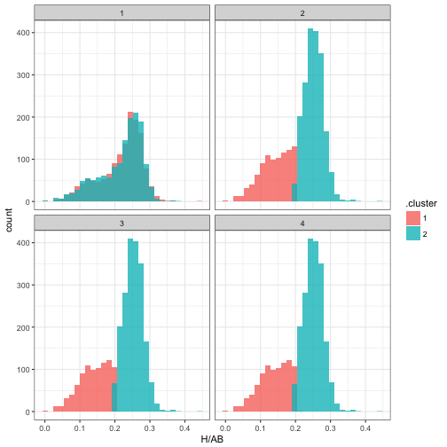
The package’s functions for mixture modeling are a bit more primitive than the rest: I’m still working out the right output format, and some of the details are likely to change (this is one of the reasons I haven’t yet submitted ebbr to CRAN). Still, the package makes it easier to experiment with expectation-maximization algorithms.
What’s Next: Simulation
We’re approaching the end of this series on empirical Bayesian methods, and have touched on many statistical approaches for analyzing binomial data, all with the goal of estimating the “true” batting average of each player. There’s one question we haven’t answered, though: do these methods actually work?
Even if we assume each player has a “true” batting average as our model suggests, we don’t know it, so we can’t see if our methods estimated it accurately. We believe that empirical Bayes shrinkage gets closer to the true probabilities than raw batting averages do, but we can’t measure its bias or mean-squared error. We can’t see whether credible intervals actually contain the true parameters, or whether our FDR control was successful in finding a set of players above a cutoff. This means we can’t test our methods, or examine when they work well and when they don’t.
In the next post, we’ll simulate some fake batting average data, which will let us know the true probabilities for each player, then examine how close our statistical methods got. Simulation is a universally useful way to test a statistical method, to build intuition about its mathematical properies, and to gain confidence that we can trust its results. This will be especially easy now that we have the ebbr package to encapsulate the methods themselves, and will be a good chance to demonstrate the tidyverse approach to simulation.