Every Christmas Eve, my family watches Love Actually. Objectively it’s not a particularly, er, good movie, but it’s well-suited for a holiday tradition. (Vox has got my back here).
Even on the eighth or ninth viewing, it’s impressive what an intricate network of characters it builds. This got me wondering how we could visualize the connections quantitatively, based on how often characters share scenes. So last night, while my family was watching the movie, I loaded up RStudio, downloaded a transcript, and started analyzing.
Parsing
It’s easy to use R to parse the raw script into a data frame, using a combination of dplyr, stringr, and tidyr. (For legal reasons I don’t want to host the script file myself, but it’s literally the first Google result for “Love Actually script.” Just copy the .doc contents into a text file called love_actually.txt).
library(dplyr)
library(stringr)
library(tidyr)

raw <- readLines("love_actually.txt")

lines <- data_frame(raw = raw) %>%
    filter(raw != "", !str_detect(raw, "(song)")) %>%
    mutate(is_scene = str_detect(raw, " Scene "),
           scene = cumsum(is_scene)) %>%
    filter(!is_scene) %>%
    separate(raw, c("speaker", "dialogue"), sep = ":", fill = "left") %>%
    group_by(scene, line = cumsum(!is.na(speaker))) %>%
    summarize(speaker = speaker[1], dialogue = str_c(dialogue, collapse = " "))
I also set up a CSV file matching characters to their actors, which you can read in separately. (I chose 20 characters that have notable roles in the story).
cast <- read.csv(url("http://varianceexplained.org/files/love_actually_cast.csv"))

lines <- lines %>%
    inner_join(cast) %>%
    mutate(character = paste0(speaker, " (", actor, ")"))
Now we have a tidy data frame with one row per line, along with columns describing the scene number and characters:

From here it’s easy to count the lines-per-scene-per-character, and to turn it into a binary speaker-by-scene matrix.
by_speaker_scene <- lines %>%
    count(scene, character)

by_speaker_scene
## Source: local data frame [162 x 3]
## Groups: scene [?]
##
## scene character n
## (int) (chr) (int)
## 1 2 Billy (Bill Nighy) 5
## 2 2 Joe (Gregor Fisher) 3
## 3 3 Jamie (Colin Firth) 5
## 4 4 Daniel (Liam Neeson) 3
## 5 4 Karen (Emma Thompson) 6
## 6 5 Colin (Kris Marshall) 4
## 7 6 Jack (Martin Freeman) 2
## 8 6 Judy (Joanna Page) 1
## 9 7 Mark (Andrew Lincoln) 4
## 10 7 Peter (Chiwetel Ejiofor) 4
## .. ... ... ...library(reshape2)
speaker_scene_matrix <- by_speaker_scene %>%
acast(character ~ scene, fun.aggregate = length)
dim(speaker_scene_matrix)## [1] 20 76Now we can get to the interesting stuff!
Analysis
Whenever we have a matrix, it’s worth trying to cluster it. Let’s start with hierarchical clustering.1
norm <- speaker_scene_matrix / rowSums(speaker_scene_matrix)

h <- hclust(dist(norm, method = "manhattan"))

plot(h)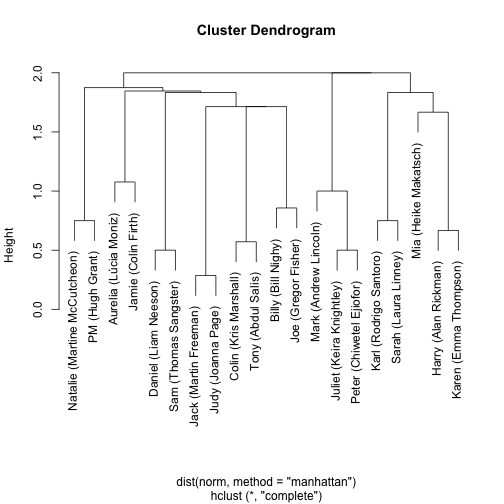
This looks about right! Almost all the romantic pairs are together (Natalia/PM; Aurelia/Jamie, Harry/Karen; Karl/Sarah; Juliet/Peter; Jack/Judy) as are the friends (Colin/Tony; Billy/Joe) and family (Daniel/Sam).
One thing this tree is perfect for is giving an ordering that puts similar characters close together:
ordering <- h$labels[h$order]
ordering
## [1] "Natalie (Martine McCutcheon)" "PM (Hugh Grant)"
## [3] "Aurelia (Lúcia Moniz)" "Jamie (Colin Firth)"
## [5] "Daniel (Liam Neeson)" "Sam (Thomas Sangster)"
## [7] "Jack (Martin Freeman)" "Judy (Joanna Page)"
## [9] "Colin (Kris Marshall)" "Tony (Abdul Salis)"
## [11] "Billy (Bill Nighy)" "Joe (Gregor Fisher)"
## [13] "Mark (Andrew Lincoln)" "Juliet (Keira Knightley)"
## [15] "Peter (Chiwetel Ejiofor)" "Karl (Rodrigo Santoro)"
## [17] "Sarah (Laura Linney)" "Mia (Heike Makatsch)"
## [19] "Harry (Alan Rickman)" "Karen (Emma Thompson)"This ordering can be used to make other graphs more informative. For instance, we can visualize a timeline of all scenes:
scenes <- by_speaker_scene %>%
    filter(n() > 1) %>%        # scenes with > 1 character
    ungroup() %>%
    mutate(scene = as.numeric(factor(scene)),
           character = factor(character, levels = ordering))

ggplot(scenes, aes(scene, character)) +
    geom_point() +
    geom_path(aes(group = scene))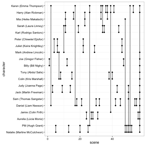
If you’ve seen the film as many times as I have (you haven’t), you can stare at this graph and the film’s scenes spring out, like notes engraved in vinyl.
One reason it’s good to lay out raw data like this (as opposed to processed metrics like distances) is that anomalies stand out. For instance, look at the last scene: it’s the “coda” at the airport that includes 15 (!) characters. If we’re going to plot this as a network (and we totally are!) we’ve got to ignore that scene, or else it looks like almost everyone is connected to everyone else.
After that, we can create a cooccurence matrix (see here) containing how many times two characters share scenes:
non_airport_scenes <- speaker_scene_matrix[, colSums(speaker_scene_matrix) < 10]

cooccur <- non_airport_scenes %*% t(non_airport_scenes)

heatmap(cooccur)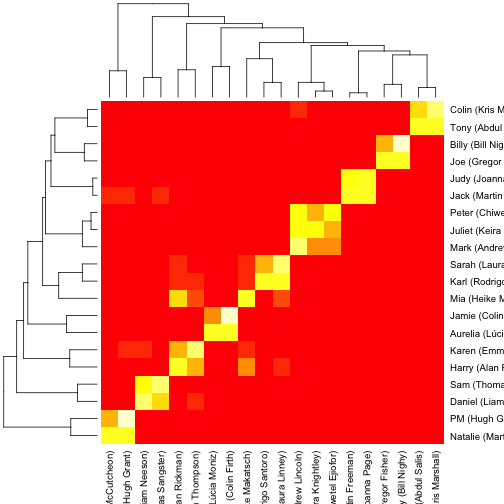
This gives us a sense of how the clustering in the above graph occurred. We can then use the igraph package to plot the network.
library(igraph)
g <- graph.adjacency(cooccur, weighted = TRUE, mode = "undirected", diag = FALSE)
plot(g, edge.width = E(g)$weight)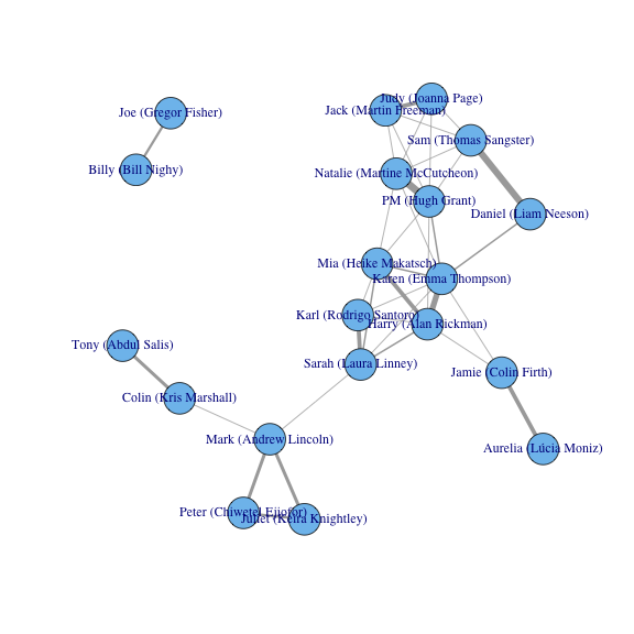
A few patterns pop out of this visualization. We see that the majority of characters are tightly connected (often by the scenes at the school play, or by Karen (Emma Thompson), who is friends or family to many key characters). But we see Bill Nighy’s plotline occurs almost entirely separate from everyone else, and that five other characters are linked to the main network by only a single thread (Sarah’s conversation with Mark at the wedding).
One interesting aspect of this data is that this network builds over the course of the movie, growing nodes and connections as characters and relationships are introduced. There are a few ways to show this evolving network (such as an animation), but I decided to make it an interactive Shiny app, which lets the user specify the scene and shows the network that the movie has built up to that point.
(You can view the code for the Shiny app on GitHub).
Data Actually
Have you heard the complaint that we are “drowning in data”? How about the horror stories about how no one understands statistics, and we need trained statisticians as the “police” to keep people from misinterpreting their methods? It sure makes data science sound like important, dreary work.
Whenever I get gloomy about those topics, I try to spend a little time on silly projects like this, which remind me why I learned statistical programming in the first place. It took minutes to download a movie script and turn it into usable data, and within a few hours, I was able to see the movie in a new way. We’re living in a wonderful world: one with powerful tools like R and Shiny, and one overflowing with resources that are just a Google search away.
Maybe you don’t like ‘Love Actually’; you like Star Wars. Or you like baseball, or you like comparing programming languages. Or you’re interested in dating, or hip hop. Whatever questions you’re interested in, the answers are just a search and a script away. If you look for it, I’ve got a sneaky feeling you’ll find that data actually is all around us.
Footnotes
-
We made a few important choices in our clustering here. First, we normalized so that the number of scenes for each character adds up to 1: otherwise, we wouldn’t be clustering based on a character’s distribution across scenes so much as the number of scenes they’re in. Secondly, we used Manhattan distance, which for a binary matrix means “how many scenes is one of these characters in that the other isn’t”. Try varying these approaches to see how the clusters change! ↩
