Previously in this series:
- The beta distribution
- Empirical Bayes estimation
- Credible intervals
- The Bayesian approach to false discovery rates
- Bayesian A/B testing
- Beta-binomial regression
- Understanding empirical Bayesian hierarchical modeling
- Mixture models and expectation-maximization
- The ebbr package
We’re approaching the end of this series on empirical Bayesian methods, and have touched on many statistical approaches for analyzing binomial (success / total) data, all with the goal of estimating the “true” batting average of each player. There’s one question we haven’t answered, though: do these methods actually work?
Even if we assume each player has a “true” batting average as our model suggests, we don’t know it, so we can’t see if our methods estimated it accurately. For example, we think that empirical Bayes shrinkage gets closer to the true probabilities than raw batting averages do, but we can’t actually measure the mean-squared error. This means we can’t test our methods, or examine when they work well and when they don’t.
In this post we’ll simulate some fake batting average data, which will let us know the true probabilities for each player, then examine how close our statistical methods get to the true solution. Simulation is a universally useful way to test a statistical method, to build intuition about its mathematical properies, and to gain confidence that we can trust its results. In particular, this post demonstrates the tidyverse approach to simulation, which takes advantage of the dplyr, tidyr, purrr and broom packages to examine many combinations of input parameters.
Setup
Most of our posts started by assembling some per-player batting data. We’re going to be simulating (i.e. making up) our data for this analysis, so you might think we don’t need to look at real data at all. However, data is still necessary to estimating the parameters we’ll use in the simulation, which keeps the experiment realistic and ensures that our conclusions will be useful.
(Note that all the code in this post can be found here).
library(Lahman)
library(dplyr)
library(tidyr)

# Grab career batting average of non-pitchers
# (allow players that have pitched <= 3 games, like Ty Cobb)
pitchers <- Pitching %>%
  group_by(playerID) %>%
  summarize(gamesPitched = sum(G)) %>%
  filter(gamesPitched > 3)

# include the "bats" (handedness) and "year" column for later
career <- Batting %>%
  filter(AB > 0) %>%
  anti_join(pitchers, by = "playerID") %>%
  group_by(playerID) %>%
  summarize(H = sum(H), AB = sum(AB))
Choosing a distribution of p and AB
In the beta-binomial model we’ve been using for most of these posts, there are two values for each player \(i\):
\[p_i \sim \mbox{Beta}(\alpha_0, \beta_0)\] \[H_i \sim \mbox{Binom}(\mbox{AB}_i, p_i)\]\(\alpha_0;\beta_0\) are “hyperparameters”: two unobserved values that describe the entire distribution. \(p_i\) is the true batting average for each player- we don’t observe this, but it’s the “right answer” for each batter that we’re trying to estimate. \(\mbox{AB}_i\) is the number of at-bats the player had, which is observed. (You might recall we had a more complicated model in the beta-binomial regression post that had \(p_i\) depend on \(AB_i\): we’ll get back to that).
Our approach is going to be to pick some “true” \(\alpha_0;\beta_0\), then simulate \(p_i\) for each player. Since we’re just picking any \(\alpha_0;\beta_0\) to start with, we may as well estimate them from our data, since we know those are plausible values (though if we wanted to be more thorough, we could try a few other values and see how our accuracy changes).
To do this estimation, we can use our new ebbr package to fit the empirical Bayes prior.
library(ebbr)
prior <- career %>%
  ebb_fit_prior(H, AB)

prior
## Empirical Bayes binomial fit with method mle
## Parameters:
## # A tibble: 1 × 2
## alpha beta
## <dbl> <dbl>
## 1 72.1 215These two hyperparameters are all we need to simulate a few thousand values of \(p_i\), using the rbeta function:
alpha0 <- tidy(prior)$alpha
beta0 <- tidy(prior)$beta

qplot(rbeta(10000, alpha0, beta0))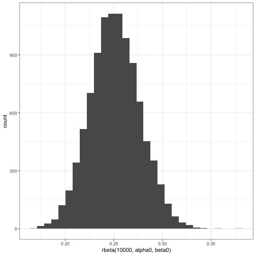
There’s another component to this model: \(\mbox{AB}_i\), the distribution of the number of at-bats. This is a much more unusual distribution:
ggplot(career, aes(AB)) +
  geom_histogram() +
  scale_x_log10()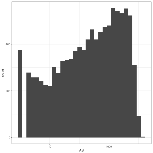
The good news is, we don’t need to simulate these \(\mbox{AB}_{i}\) values, since we’re not trying to estimate them with empirical Bayes. We can just use the observed values we have! (In a different study, we may be interested in how the success of empirical Bayes depends on the distribution of the \(n\)s).
Thus, to recap, we will:
- Estimate \(\alpha_0;\beta_0\), which works because the parameters are not observed, but there are only a few and we can predict them with confidence.
- Simulate \(p_i\), based on a beta distribution, so that we can test our ability to estimate them.
- Use observed \(\mbox{AB}_i\), since we know the true values and we might as well.
Shrinkage on simulated data
The beta-binomial model is easy to simulate, with applications of the rbeta and rbinom functions:
# always set a seed when simulating
set.seed(2017)

career_sim <- career %>%
  mutate(p = rbeta(n(), alpha0, beta0),
         H = rbinom(n(), AB, p))

career_sim
## # A tibble: 10,388 × 4
## playerID H AB p
## <chr> <int> <int> <dbl>
## 1 aaronha01 3817 12364 0.299
## 2 aaronto01 240 944 0.249
## 3 abadan01 5 21 0.274
## 4 abadijo01 9 49 0.198
## 5 abbated01 755 3044 0.249
## 6 abbeych01 449 1751 0.265
## 7 abbotda01 2 7 0.191
## 8 abbotfr01 138 513 0.251
## 9 abbotje01 116 596 0.244
## 10 abbotku01 570 2044 0.261
## # ... with 10,378 more rowsJust like that, we’ve generated a “true” \(p_i\) for each player, and then a new value of \(H\) based on it. (This means there is no relationship between how good a particular player is in our simulation and how good they are in reality).
Our working theory has been that our raw \(H / \mbox{AB}\) estimates have had a large amount of noise when \(\mbox{AB}\) is small, and that empirical Bayes helps moderate it. Now, since we know the true value of \(p_i\) for each player, we can finally examine whether that’s true: and we can see what the empirical Bayes method is giving up as well.
Let’s visualize the true values of \(p_i\) versus the estimates, which we’ll call \(\hat{p_i}\), using either raw estimation or empirical Bayes shrinkage. (Again, we couldn’t have made this plot with the real data since we don’t know the true \(p_i\): it’s possible only in our simulation).
career_sim_eb <- career_sim %>%
  add_ebb_estimate(H, AB)

career_sim_gathered <- career_sim_eb %>%
  rename(Shrunken = .fitted, Raw = .raw) %>%
  gather(type, estimate, Shrunken, Raw)
career_sim_gathered %>%
filter(AB >= 10) %>%
ggplot(aes(p, estimate, color = AB)) +
geom_point() +
geom_abline(color = "red") +
geom_smooth(method = "lm", color = "white", lty = 2, se = FALSE) +
scale_color_continuous(trans = "log", breaks = c(10, 100, 1000, 10000)) +
facet_wrap(~ type) +
labs(x = "True batting average (p)",
y = "Raw or shrunken batting average",
title = "Empirical Bayes shrinkage reduces variance, but causes bias",
subtitle = "Red line is x = y; dashed white line is a linear fit")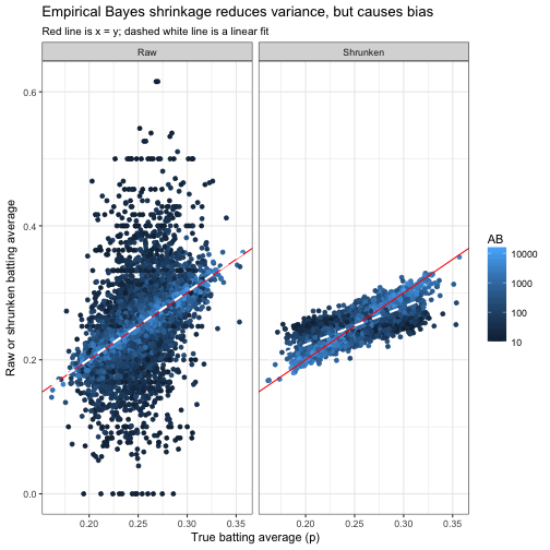
Our method works: the Raw (H / AB) estimates have a lot more noise than the shrunken estimates, just as we expected. (We filtered out cases where \(AB < 10\) in this graph: if we hadn’t, the difference would have been even starker).
However, notice the dashed line representing the best-fit slope. One property that we’d prefer an estimate to have is that it’s equally likely to be an overestimate or an underestimate (that is, that \(E[\hat{p}]=p\)), and that’s true for the raw average. However, the shrunken estimate tends to be too high for low values of \(p\), and too low for high values of \(p\). The empirical Bayes method has introduced bias into our estimate, in exchange for drastically reducing the variance. This is a classic tradeoff in statistics and machine learning.
Mean-squared error and bias relative to AB
Typically, when statisticians are facing a tradeoff between bias and variance, we use mean squared error (or MSE) as a balance, which is computed as \(\mbox{MSE}=\frac{1}{n}\sum_{1}^{n}(p-\hat{p})^2\). We can easily compute that for both the raw and shrunken methods:
career_sim_gathered %>%
  group_by(type) %>%
  summarize(mse = mean((estimate - p) ^ 2))
## # A tibble: 2 × 2
## type mse
## <chr> <dbl>
## 1 Raw 0.01516
## 2 Shrunken 0.00035The MSE of the shrunken estimate was much lower than the raw estimate, as we probably could have guessed by eyeballing the graph. So by this standard, the method succeeded!
We’ve seen in the graph how the variance depends on \(\mbox{AB}\), so we may want to compute the MSE within particular bins. We should use logarithmic bins (10 ^ (round(log10(AB))) is a handy shortcut).
metric_by_bin <- career_sim_gathered %>%
  group_by(type, AB = 10 ^ (round(log10(AB)))) %>%
  summarize(mse = mean((estimate - p) ^ 2))

ggplot(metric_by_bin, aes(AB, mse, color = type)) +
  geom_line() +
  scale_x_log10() +
  scale_y_log10() +
  labs(x = "Number of at-bats (AB)",
       y = "Mean-squared-error within this bin (note log scale)",
       title = "Mean squared error is higher with raw estimate, especially for low AB")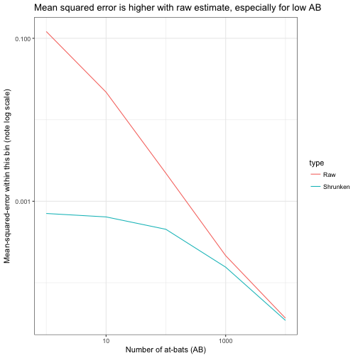
We could also examine the bias within each bin, measured as the slope between the estimate and the true value of \(p\).
career_sim_gathered %>%
  mutate(AB = 10 ^ (round(log10(AB)))) %>%
  filter(AB > 1) %>%
  nest(-type, -AB) %>%
  unnest(map(data, ~ tidy(lm(estimate ~ p, .)))) %>%
  filter(term == "p") %>%
  ggplot(aes(AB, estimate, color = type)) +
  geom_line() +
  scale_x_log10(breaks = c(10, 100, 1000, 10000)) +
  geom_hline(yintercept = 1, lty = 2) +
  labs(x = "Number of at-bats (AB)",
       y = "Slope of estimate/p within this bin",
       title = "Shrunken estimates introduce bias for low AB",
       subtitle = "Note that an unbiased estimate would have a slope of 0")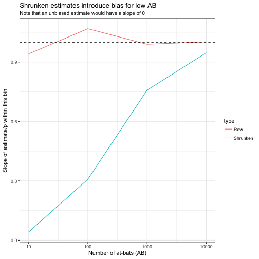
Another way to visualize how this tradeoff between bias and variance happens for varying AB is to recreate the above graph of the true batting average versus the estimate, this time binning by \(AB\).
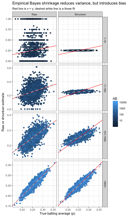
Notice how the variance around the true (red) line shrinks in the raw estimate, and the bias (the flatness of the gray dashed line) in the shrunken estimate decreases, until both look quite similar in the 1000+ bin.
Credible intervals
Besides the shrunken empirical Bayes estimates, the add_ebb_estimate function also adds credible intervals for each of our players. For example, we
set.seed(2017)

career_sim_eb %>%
  sample_n(20) %>%
  mutate(playerID = reorder(playerID, .fitted)) %>%
  ggplot(aes(.fitted, playerID)) +
  geom_point() +
  geom_point(aes(x = p), color = "red") +
  geom_errorbarh(aes(xmin = .low, xmax = .high)) +
  theme(axis.text.y = element_blank()) +
  labs(x = "Estimated batting average (w/ 95% credible interval)",
       y = "Player",
       title = "Credible intevals for 20 randomly selected players",
       subtitle = "The true batting average of each player is shown in red")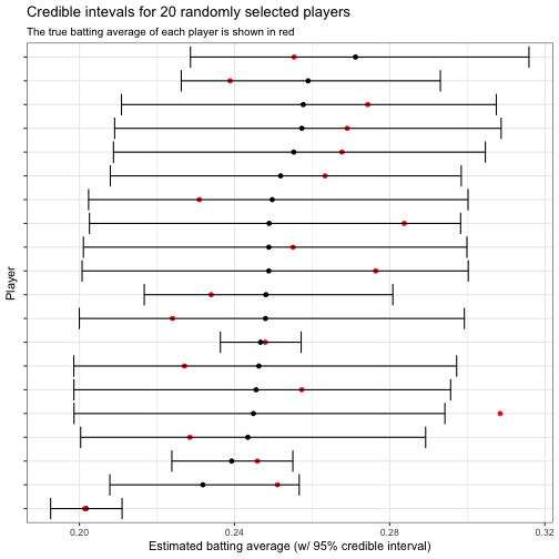
Notice that out of 20 randomly selected players, the credible interval contained the true batting average (shown in red) in 19 case. This is a 95% coverage rate, which is just what we’d hoped for! Indeed, we can examine this across all players and see that 95% of the intervals contained the true probability:
career_sim_eb %>%
  summarize(coverage = mean(.low <= p & p <= .high))
## # A tibble: 1 × 1
## coverage
## <dbl>
## 1 0.949We could also have set the threshold of the credible interval to 90%, or 75%. Does the probability that the parameter is contained within the interval change accordingly?
library(purrr)

# fit the prior once
sim_prior <- ebb_fit_prior(career_sim, H, AB)

# find the coverage probability for each level
estimate_by_cred_level <- data_frame(level = seq(.5, .98, .02)) %>%
  unnest(map(level, ~ augment(sim_prior, career_sim, cred_level = .)))

estimate_by_cred_level %>%
  group_by(level) %>%
  mutate(cover = .low <= p & p <= .high) %>%
  summarize(coverage = mean(cover)) %>%
  ggplot(aes(level, coverage)) +
  geom_point() +
  geom_abline(color = "red") +
  labs(x = "Level of credible interval",
       y = "Probability credible interval contains the true value")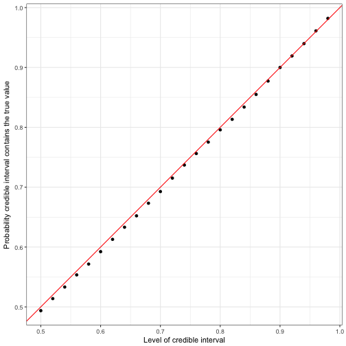
Notice that the probability (the points) hugs the red \(x=y\) line almost precisely. This shows that these per-observation credible intervals are generally well-calibrated: if you ask for a X% credible interval, you get a region that contains the true parameter about X% of the time.
FDR control
In another post we considered the problem of Bayesian hypothesis testing and FDR control. In particular, we considered the problem of constructing a list of players whose true batting average was above .300, and controlling such that only (say) 10% of the players on the list were included incorrectly.
The q-value, which controls FDR, can be calculated with the add_ebb_prop_test function:
pt <- career_sim_eb %>%
  add_ebb_prop_test(.3, sort = TRUE)

# Control for FDR of 10%
hall_of_fame <- pt %>%
  filter(.qvalue <= .1)
nrow(hall_of_fame)
## [1] 74If the FDR control were successful, we’d expect 10% of the true batting averages (p) to be false discoveries, and therefore below .300. Did it work?
mean(hall_of_fame$p < .3)## [1] 0.0946Yes- almost exactly 10% of the players included in this “hall of fame” were included incorrectly, indicating that the q-value succeeded in controlling FDR. We could instead try this for all q-values, using the cummean function:
pt %>%
  mutate(true_fdr = cummean(p < .3)) %>%
  ggplot(aes(.qvalue, true_fdr)) +
  geom_line() +
  geom_abline(color = "red") +
  labs(x = "q-value",
       y = "True FDR at this q-value threshold")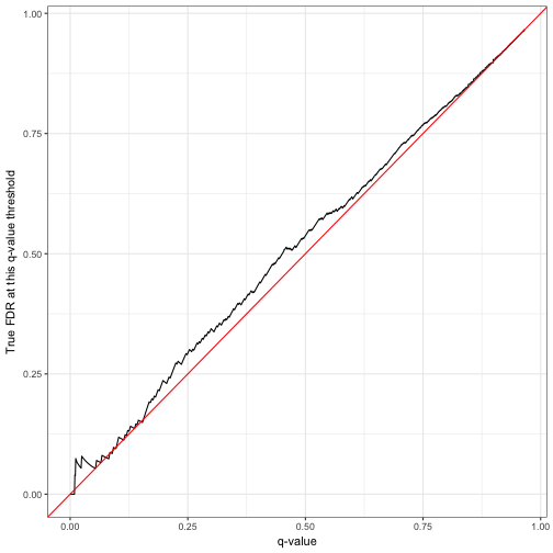
Notice that the FDR was often a little bit higher than we aimed for with the q-value, which could be due to random noise. Later in this post, we’ll perform many replications of this simulation and confirm whether the FDR method was successful on average.
Beta-binomial regression
Most simulation analyses start with a simple model, than gradually add complications. In a post on beta-binomial regression, we discovered that there is a relationship between \(\mbox{AB}_i\) and the true batting average \(p_i\) that we need to incorporate into our model. Let’s add that complication to our simulation, and see if the method we used to account for it actually works.
The model described in that post had three hyperparameters: \(\mu_0\), \(\mu_{\mbox{AB}}\) and \(\sigma_0\). Then each of the probabilities \(p_i\) was computed as:
\[\mu_i = \mu_0 + \mu_{\mbox{AB}} \cdot \log(\mbox{AB})\] \[\alpha_{0,i} = \mu_i / \sigma_0\] \[\beta_{0,i} = (1 - \mu_i) / \sigma_0\] \[p_i \sim \mbox{Beta}(\alpha_{0,i}, \beta_{0,i})\] \[H_i \sim \mbox{Binom}(\mbox{AB}_i, p_i)\]Much as we estimated \(\alpha_0\) and \(\beta_0\) from the data before using them in the simulation, we would estimate \(\mu_0\), \(\mu_\mbox{AB}\), and \(\sigma_0\) from the data:
bb_reg <- career %>%
  ebb_fit_prior(H, AB, method = "gamlss", mu_predictors = ~ log10(AB))

tidy(bb_reg)
## # A tibble: 3 × 6
## parameter term estimate std.error statistic p.value
## <fctr> <chr> <dbl> <dbl> <dbl> <dbl>
## 1 mu (Intercept) -1.688 0.00907 -186.1 0
## 2 mu log10(AB) 0.192 0.00280 68.7 0
## 3 sigma (Intercept) -6.299 0.02316 -272.0 0It turns out this step is pretty easy with the augment method of the beta-binomial prior.
set.seed(2017)

career_sim_ab <- augment(bb_reg, career) %>%
  select(playerID, AB, true_alpha0 = .alpha0, true_beta0 = .beta0) %>%
  mutate(p = rbeta(n(), true_alpha0, true_beta0),
         H = rbinom(n(), AB, p))
Performance of beta-binomial regression method
First question: are we able to extract the right hyperparameters through beta-binomial regression? We’ll fit the prior and then compare:
career_ab_prior <- career_sim_ab %>%
ebb_fit_prior(H, AB, method = "gamlss", mu_predictors = ~ log10(AB))tidy(bb_reg)## # A tibble: 3 × 6
## parameter term estimate std.error statistic p.value
## <fctr> <chr> <dbl> <dbl> <dbl> <dbl>
## 1 mu (Intercept) -1.688 0.00907 -186.1 0
## 2 mu log10(AB) 0.192 0.00280 68.7 0
## 3 sigma (Intercept) -6.299 0.02316 -272.0 0tidy(career_ab_prior)## # A tibble: 3 × 6
## parameter term estimate std.error statistic p.value
## <fctr> <chr> <dbl> <dbl> <dbl> <dbl>
## 1 mu (Intercept) -1.688 0.00908 -185.9 0
## 2 mu log10(AB) 0.193 0.00281 68.7 0
## 3 sigma (Intercept) -6.279 0.02564 -244.9 0That’s sure pretty close! It looks like beta-binomial regression was able to estimate the true parameters accurately, which suggests the resulting prior (which depends on \(\mbox{AB}_i\)) will be accurate.
How did this prior, which depends on \(AB\), affect our shrunken estimates? Again, since we’re working from a simulation we can compare the true values to the estimates, and do so within each model.
career_flat_prior <- career_sim_ab %>%
ebb_fit_prior(H, AB)data_frame(method = c("Flat prior", "Prior depending on AB"),
model = list(career_flat_prior, career_ab_prior)) %>%
unnest(map(model, augment, data = career_sim_ab)) %>%
ggplot(aes(p, .fitted, color = AB)) +
geom_point() +
scale_color_continuous(trans = "log") +
geom_abline(color = "red") +
facet_wrap(~ method) +
labs(x = "True batting average (p)",
y = "Shrunken batting average estimate")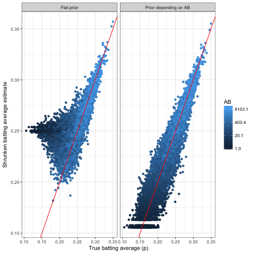
Look at the bias when we don’t take the AB to batting average relationship into account: batters with low AB and low averages were universally overestimated. This is exactly the issue we had expected in the beta-binomial regression post:
Since low-AB batters are getting overestimated, and high-AB batters are staying where they are, we’re working with a biased estimate that is systematically overestimating batter ability.
If you’re interested, you could take this more complex model and perform the same examinations of credible intervals and priors that we did for the simple model. (Indeed, you could incorporate some of the other trends that could affect your prior, such as year and handedness, that were considered in our hierarchical model).
Replications
So far, we ran a single simulation of our players’ batting averages, used it to perform estimation, and then examined whether our results were accurate. This is a valuable way to sanity-check the accuracy of the empirical Bayes method.
But what if we just got lucky? What if empirical Bayes shrinkage works about half the time, and on some datasets it gives terrible results? This is an important concern if we want to trust the method on our real data. As the next step, rather than simulating a single example, let’s create 50 simulations, and run the method on each of them. We can then examine how the method performs on real data.
set.seed(2017)

sim_replications <- career %>%
  crossing(replication = 1:50) %>%
  mutate(p = rbeta(n(), alpha0, beta0),
         H = rbinom(n(), AB, p))

sim_replications
## # A tibble: 519,400 × 5
## playerID H AB replication p
## <chr> <int> <int> <int> <dbl>
## 1 aaronha01 3624 12364 1 0.299
## 2 aaronha01 3090 12364 2 0.249
## 3 aaronha01 3407 12364 3 0.274
## 4 aaronha01 2418 12364 4 0.198
## 5 aaronha01 3112 12364 5 0.249
## 6 aaronha01 3253 12364 6 0.265
## 7 aaronha01 2421 12364 7 0.191
## 8 aaronha01 3075 12364 8 0.251
## 9 aaronha01 2974 12364 9 0.244
## 10 aaronha01 3186 12364 10 0.261
## # ... with 519,390 more rows(This is the slowest step of our simulation: if you’re following along and want to speed it up, you could turn down the number of replications from 50).
sim_replication_models <- sim_replications %>%
  nest(-replication) %>%
  mutate(prior = map(data, ~ ebb_fit_prior(., H, AB)))
Estimations of prior parameters
sim_replication_priors <- sim_replication_models %>%
  unnest(map(prior, tidy), .drop = TRUE)

sim_replication_priors
## # A tibble: 50 × 4
## replication alpha beta mean
## <int> <dbl> <dbl> <dbl>
## 1 1 73.9 220 0.251
## 2 2 71.3 212 0.252
## 3 3 71.9 214 0.251
## 4 4 68.1 204 0.251
## 5 5 73.8 220 0.251
## 6 6 76.3 228 0.251
## 7 7 74.1 221 0.251
## 8 8 72.3 216 0.250
## 9 9 70.1 209 0.251
## 10 10 72.3 216 0.251
## # ... with 40 more rowsMuch like our earlier individual simulation, it looks like most of these are pretty close to each other, and to the true \(\alpha_0\) and \(\beta_0\). We could visualize to confirm:
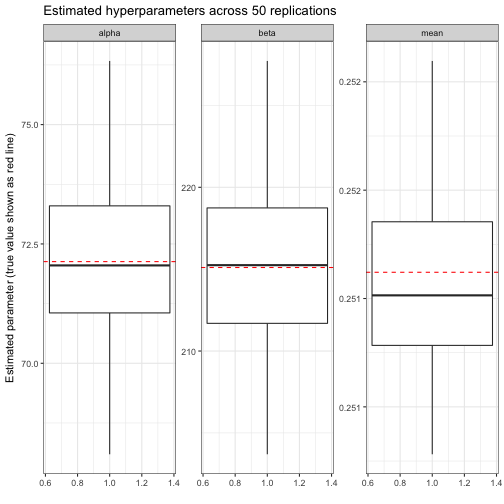
We thus notice that our estimates of \(\alpha_0\), \(\beta_0\), and the mean \(\alpha_0 / (\alpha_0 + \beta_0)\) are mostly unbiased: generally they’re equally likely to be above or below the true parameter. We particularly note that the mean is almost always between .251 and .252; since this is what every player is being shrunk towards, it’s good that we’re so precise.
Our accuracy gives us confidence in the empirical Bayesian approach for this problem: we have enough data that we can feel good about estimating the hyperparameters from the data, and then using those hyperparameters as our prior.
Estimates, intervals, and hypothesis testing across replications
Now that we’ve seen that the prior parameters are generally estimated accurately, we can examine whether the empirical Bayes shrinkage and credible intervals worked on average.
One of the first metrics we examined in the simulation was the mean squared error between the true . This was . Did we just get lucky with that run?
sim_replication_au <- sim_replication_models %>%
  unnest(map2(prior, data, augment))
sim_replication_mse <- sim_replication_au %>%
rename(Raw = .raw, Shrunken = .fitted) %>%
gather(type, estimate, Raw, Shrunken) %>%
group_by(type, replication) %>%
summarize(mse = mean((estimate - p) ^ 2))
ggplot(sim_replication_mse, aes(type, mse)) +
geom_boxplot() +
ylab("Mean squared error across 50 replications")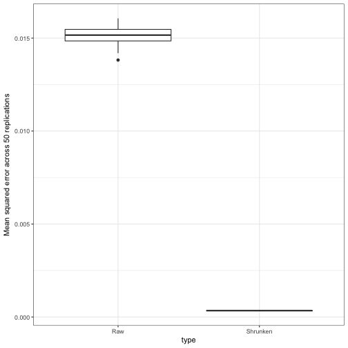
No, it looks like the MSE was always much lower than the raw estimates. This is a good sign: even in 50 examples, it never fails “catastrophically” and gives terrible estimates. This is not true of all methods!
We earlier saw that the credible intervals had good coverage probabilities: is this usually true?
sim_replication_au %>%
  mutate(cover = .low <= p & p <= .high) %>%
  group_by(replication) %>%
  summarize(coverage = mean(cover)) %>%
  ggplot(aes(coverage)) +
  geom_histogram(binwidth = .001) +
  labs(x = "% of time true value was in a 95% confidence interval",
       title = "95% credible interval is well calibrated across replications")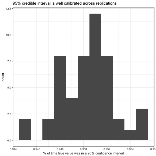
Yes, it looks like the coverage of a 95% credible interval was generally between 94.4% and 95.5%. Is it well calibrated at other levels: does an 80% credible interval contain the true value about 80% of the time?
We earlier created a plot that compares credibility level to the % of intervals containing the true parameter. We can now recreate that plot, but do it across all fifty replications:
sim_replication_intervals <- sim_replication_models %>%
  crossing(cred_level = c(seq(.5, .9, .05), .95)) %>%
  unnest(pmap(list(prior, data, cred_level = cred_level), augment)) %>%
  select(replication, cred_level, p, .low, .high)
sim_replication_intervals %>%
mutate(cover = .low <= p & p <= .high) %>%
group_by(replication, cred_level) %>%
summarize(coverage = mean(cover)) %>%
ggplot(aes(cred_level, coverage, group = replication)) +
geom_line(alpha = .3) +
geom_abline(color = "red") +
labs(x = "Credibility level",
y = "% of credible intervals in this replication that contain the true parameter",
title = "Credible intervals are well calibrated across 50 replications",
subtitle = "Red line is x = y")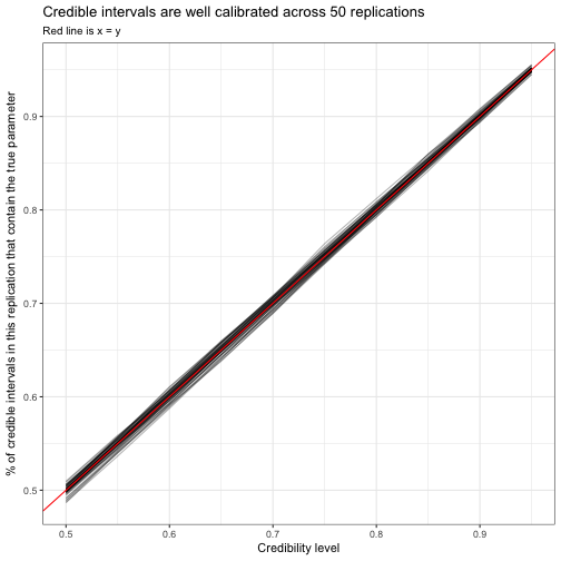
Each of these lines is one replication tracing from a “50% credible interval” to a “95% credible interval”: since all the lines are close to the red \(x=y\) line, we can see that an X% credible interval contains the true value about X% of the time. This is an important lesson of tidy simulations: whenever you can make a plot to check one simulation to check accuracy or calibration, you can also recreate the plot across many replications.
We can also examine our method for false discovery rate control, and see whether we can trust a q-value of (say) .05 to keep the FDR below 5%. The approach is similar to the one for credible interval coverage (so I won’t show the code here): group by each replication, then perform the same analysis we did on a single replication.
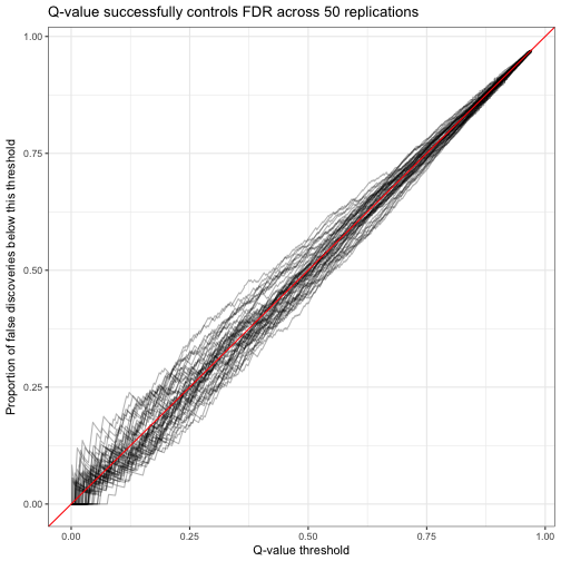
Each of these lines represents a replication tracing along every possible q-value threshold. We see that the proportion of false discoveries below a q-value is sometimes higher than the q-value promises, and sometimes lower. That’s OK: the promise of FDR control isn’t that the false discovery rate will always be exactly 5% (that would be impossible due to random noise), but that it would be on average.
These replications are just a start in terms of the random simulations we could perform to examine the method. For example, we could have varied the size of each replication (by randomly subsampling batters out of our total). Would our method still have been accurate if we had only 1,000 batters, or 100? We could have varied the algorithm used to estimate our hyperparameters: what if we’d used the (much faster) method of moments to compute the beta prior, rather than maximum likelihod? I encourage you to explore other simulations you might be interested in.
Conclusion: “I have only proved it correct, not simulated it”
Computer scientist Donald Knuth has a famous quote: “Beware of bugs in the above code; I have only proved it correct, not tried it.” I feel the same way about statistical methods.
When I look at mathematical papers about statistical methods, the text tends to look something like:
Smith et al (2008) proved several asymptotic properties of empirical Bayes estimators of the exponential family under regularity assumptions i, ii, and iii. We extend this to prove the estimator of Jones et al (2001) is inadmissable, in the case that \(\hat{\theta}(x)\) is an unbiased estimator and \(g(y)\) is convex…
This kind of paper is an important part of the field, but it does almost nothing for me. I’m not particularly good at manipulating equations, and I get rustier every year out of grad school. If I’m considering applying a statistical method to a dataset, papers and proofs like this won’t help me judge whether it will work. (“Oh- I should have known that my data didn’t follow regularity assumption ii!”) What does help me is the approach we’ve used here, where I can see for myself just how accurate the method tends to be.
For example, last month I was working on a problem of logistic regression that I suspected had mislabeled outcomes (some zeroes turned to ones, and vice versa), and read up on some robust logistic regression methods, implemented in the robust package. But I wasn’t sure they would be effective on my data, so I did some random simulation of mislabeled outcomes and applied the method. The method didn’t work as well as I needed it to, which saved me from applying it to my data and thinking I’d solved the problem.
For this reason, no matter how much math and proofs there are that show a method is , I really only feel comfortable with a method once I’ve worked with it simulated data. It’s also a great way to teach myself about the statistical method.
What’s Next
This post is the last of my ten-part series about empirical Bayesian methods applied to baseball batting data. This is the first time I’ve extended an analysis and discussion across a long series of posts, and it was a very positive experience. I hope you’ve enjoyed it and learned something useful.
But stay tuned, because this isn’t the last of my plans for the empirical Bayes series. I’ve got an upcoming announcement about how it will be expanded into a new format. (Be sure to subscribe in the form on the left if you’re interested).
